CS 120, Fall 2011, Lab 8:
Image Processing with Gimp
GIMP, the Gnu Image Manipulation Program,
is a free program that has many of the capabilities of the
commercial program, Photoshop. Gimp can be used both for creating images
from scratch and for modifying existing photographic images. This
lab is a basic introduction to some of the painting tools and other
features of the Gimp. The lab uses Gimp version 2.6.
Your assignment for this lab is to produce five images using
Gimp, as discussed below, and to make a web page to display those
images. In addition to the images, the web page should say something
about how each image was produced. The web page should be available
on the web, in your web portfolio, by next Friday. There should
be an easy-to-find link on the main index page of your portfolio
that leads to the web page that you create for this lab.
You will not be using Aptana for this lab, except possibly
to work on your web portfolio. You will find Gimp on the lab
computers in the "Graphics" submenu of the "Applications" menu.
Find it, and start it up!
(Note: Gimp is discussed in Book 8, Chapter 4, pages 941--960,
in the textbook.)
New, Open, Save
When you start Gimp for the first time, you will probably see
three windows. One is an empty image window, with a row of menus across
the top. The others are dialog boxes.
The "File" menu in the image
window has the usual commands such as "New", "Open", "Save",
"Save As", "Close", and "Quit". Gimp is most often used to modify
existing images. Use the "Open" command to open an existing image.
Use the "New" command to create a new, blank image; you will get
a dialog box where you can specify the size of the image.
When saving an image, you can specify the kind of image that
you want to save by adding the appropriate extension to the file
name. In practice, you will want a JPEG image in most cases.
However, if the image has transparent or translucent regions, or if it
is a line drawing, PNG is the preferred format.
Use the file extension jpeg (or .jpg) for a JPEG image, or use
.png for a PNG image.
1. Create a Logo
When you start Gimp for the first time, you will probably see
three windows. One is an empty image window, with a row of menus across
the top. The others are dialog boxes. Note that you can also call
up the menus by right-clicking on an image window.
For the first exercise, you will use one of the submenus
in the "File" menu to create a logo. The logo will be an image
containing some text, suitable for use as a header on a
web page. You should use the logo that you create as a header
on the web page that you create for this lab. You might also
want to use it -- or create another one -- as a header for the
index page of your portfolio.
To create a logo, go to "File" / "Create" / "Logos", and select
one of the logos from the list. You will get a dialog box where
you get to enter some text for the logo. You might want to change
the font and the font size. There will be other settings that you
can play with, but you will probably want to leave them alone, at
least at first. Here's an example that I made, using the "3D Outline"
logo:
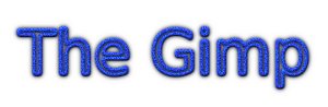
You will probably have to try several logo styles before you find
one that you like. Once you have one that you want to keep, use
the "Save" command to save it to a file.
You might be asked to "Flatten the image", or something like that,
before saving. It is OK to do that and to accept the defaults for
any other choice that you have to make.
(The thing about flattening an image happens because most of the
logos use "layers". Layers are an important aspect of using the
Gimp, but you don't have to bother with them in this lab. The
layers in an image are shown in the Layers dialog box. If you
want to edit an image that has layers, then to avoid confusion,
I suggest that you get rid of the layers: To do this, right-click
in the Layers dialog box, and select "Merge Visible Layers".
Layers are created for logos and by some of the filters that are
discussed later on this page.)
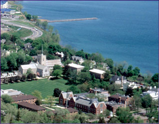
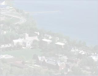
2. Make a Background Image
A good background image has only a small range of colors, so that
the text on top of the image can be read easily. For dark text,
you want a light background image. For light text, you want a dark
background image.
Gimp has several tools for adjusting the colors in an image. You'll find them
in the "Colors" menu. For this exercise, you should apply the "Levels" tool
to a photographic image. Here is an example. I used "Levels" to adjust
the "Values" in the image on the left below, giving the faded image on the
right. This would make the image more suitable as a background for dark text.
Here is how I used the Levels tool to do this. While editing the
original image, I used the "Levels" command in the "Colors" Menu.
Here is part of the Levels dialog box:
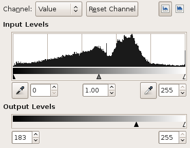
The "Input Levels" area shows data from the original image. The "Output
Levels" area shows how the input data will be mapped onto the data for
the modified image. In this case, I simply dragged the small black triangle under
"Output Levels" to the right into the position you see here. This says that
input values between 0 and 255 are mapped onto output values between 183 and 255.
This means, essentially, that all the pixels become whiter. To make a darker
image, you would slide the white triangle to the left. In general, you will
have to adjust both triangles to get the range of colors that you want.
(You might try changing the "Channel" setting of the Levels dialog from
"Value" to "Red", "Blue", or "Green". This allows you to adjust just
the selected color component of the image.)
You should use the "Levels" tool to adjust the colors of an image to
make it suitable for use as a background image. You can use one of the
images in the folder /classes/cs120/lab8-pics, or you can use one
from some other source. I like the surface of mercury image.
(Another source of images is the
wikipedia commons, http://commons.wikimedia.org.
To find images that you can use freely on your web site without attribution, try adding
"public domiain" to the search. For example, search for "flower public domain" to
search for images of flowers in the public domain. There are also many
images that are free to use, as long you include an attribution to the
copyright owner. Check the specific restrictions on the image that you
want to use.)
3. Use A Filter (or Several)
A "filter" is something that can be applied to an image, usually
to modify the image in some way. They might better be called
"effects." For example, there is a filter for blurring the
image, one for making the image look like an old photograph,
and one to make it look like its made out of cloth. Some filters
in Gimp generate images from nothing, and some do even more
complicated things. You will find Gimp's filters in the
"Filter" menu.
You should make an attractive or interesting image by
applying one or more filters. Experiment with applying
various filter to an existing image.
Again, you can use
an image from /classes/cs120/lab8-pics or one of
your own. You probably don't want to work on a really big
image for this exercise. To reduce the size of the image,
use the "Scale Image" command in the "Image" menu. Ask for
help if you need it.
As you experiment, use the "Undo" command, CONTROL-Z, to undo
any changes that you don't like!
Some suggested filters to try: Distorts/Emboss, Distorts/Mosaic,
Distorts/Ripple, Edge-Detect, Artistic/Apply-Canvas, Artistic/Cubism,
Decor/Old-Photo, Map/Warp.
You might want to show the same image, with several different
effects applied to it.
As mentioned, some of Gimp's filters actually create content
from scratch. In particular, you might use Render/Lava, or any
of the filters in Render/Clouds to make a background image.
Start with the "New" command. Specify a small size, such as
256-by-256. Use a filter such as Render/Clouds/Solid-Noise
or Render/Clouds/Plasma. Adjust the colors, if you like.
Now, choose Filters/Map/Make-Seamless. This makes the
image "tilable," so that the left edge matches up with the
right edge and the top edge with the bottom. If you are reading
this page in a web browser, the background image
on this section of the page was made in this way.
4. Start From Scratch
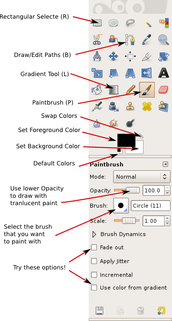 So far, I haven't mentioned one of the most important
Gimp windows: the Toolbox dialog. This window is always open
while Gimp is running; closing the Toolbox will exit from
the program. The Toolbox is
shown at the right, with some of its features labeled. It has icons
for the various painting tools and for setting the foreground and
background colors. In the actual toolbox, you can point
your mouse at an icon to see a short description of that tool.
Below the icon area are the tool options for
the currently selected tool. When you select a different tool,
this part of the window changes to reflect the options for the
selected tool. Initially, the paintbrush tool is selected, and
the options for the paintbrush are shown.
So far, I haven't mentioned one of the most important
Gimp windows: the Toolbox dialog. This window is always open
while Gimp is running; closing the Toolbox will exit from
the program. The Toolbox is
shown at the right, with some of its features labeled. It has icons
for the various painting tools and for setting the foreground and
background colors. In the actual toolbox, you can point
your mouse at an icon to see a short description of that tool.
Below the icon area are the tool options for
the currently selected tool. When you select a different tool,
this part of the window changes to reflect the options for the
selected tool. Initially, the paintbrush tool is selected, and
the options for the paintbrush are shown.
For your fourth exercise, you should create an image from scratch,
using the painting tools. I don't expect you to be an artist,
but try to make someting interesting or nice looking.
Use the "New" command in the file menu
to create a new, empty image. Don't make it too big -- maybe
640-by-480 or 500-by-400. Try out the paintbrush tool, and try
changing some of its options. Try changing the foreground color
(which is used for drawing) by clicking on the forgeground color
patch in the Toolbox. Remember that CONTROL-Z can be used to
undo any change you make. Also, of course, you can always start
over. You will want to spend some time experimenting with
various tools before setting out to create your final image.
You'll notice that Gimp does not have tools for drawing shapes
such as rectangles and circles. However, it is possible to draw
such shapes using selections. The selection tools -- at
the top of the Toolbox -- can be used to select regions in the
image. For example, click the Rectangle tool, and drag the
mouse on the image to select a rectangular region. Note that
one of the options for the Rectangle select allows you
to round off the corners of the rectangle. The Ellipse
Select tool can be used to select ovals in the image.
The Free Select (or Lasso) tool, which is next to the Ellipse,
can be used to select polygonal regions: Just click a sequence
of points to select the vertices of the polygon, and click back
on the initial point to close the polygon. You can also
drag the Lasso tool to draw the outline of a region freehand.
Once you have a selection, there are many things that you
can do with it. One important fact is that when there is
a selection, you can only draw inside the selection -- the
area outside the selection is unaffected by painting tools.
The Bucket Fill Tool, which looks like a spilling paint bucket,
is especially useful with selections. Choose the bucket tool, and
set its option to "Fill entire selection". Then click inside
the selected area to fill that area with color. Also try setting
the "Pattern fill" option for the Bucket tool, which allows you
to fill the selected area with a pattern. To change the pattern
that is used, click on the image of the pattern, just below the
"Pattern fill" option.
Selections are one of the most important aspects of Gimp.
There are many ways to make selections, and there is an entire
menu devoted to manipulating selections. For example, use
the "Border" command in the "Select" menu to make a selection
consisting just of the outline of the current selection.
Drawing straight lines in Gimp is a little strange.
To draw a line with the Paintbrush tool, click the mouse on the
image, then immediately press the shift key. Move the mouse while
holding down the shift key (without holding down any button on the
mouse). Then click the mouse again. A line is
drawn from the original click to the final click. This technique
works with some other tools besides the paintbrush.
 You will certainly want to try the Gradient Tool. A gradient is a sequence of colors, arranged in
some pattern. Many different gradients are avaiable in the Gradient tool options; click the
image of the gradient, in the gradient options, to choose a different gradient.
Apply a gradient by dragging the mouse to specify the points where the color sequence begins and
ends. The colors can be applied in various shapes; try changing the "Shape" option to
see how this works. Remember that you can limit the area affected by the gradient by
making a selection. Also note that some of the more interesting gradients include
transparent colors, which create regions where the gradient is transparent or translulcent.
You will certainly want to try the Gradient Tool. A gradient is a sequence of colors, arranged in
some pattern. Many different gradients are avaiable in the Gradient tool options; click the
image of the gradient, in the gradient options, to choose a different gradient.
Apply a gradient by dragging the mouse to specify the points where the color sequence begins and
ends. The colors can be applied in various shapes; try changing the "Shape" option to
see how this works. Remember that you can limit the area affected by the gradient by
making a selection. Also note that some of the more interesting gradients include
transparent colors, which create regions where the gradient is transparent or translulcent.
Note: For smoother gradients, turn on "Adaptive supersampling" in the gradient tool options.
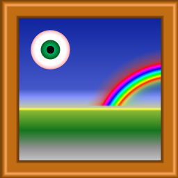
The picture on the left, for example,
was made entirely with the Gradient tool, using, for example, the "Square Wood Frame"
gradient with the shape option set to "Square" and the "Radial Eyeball" and "Radial Rainbow
Hoop" gradients with the shape set to "Radial." The Gradient tool can be used for some neat
effects. The background image for this page was prepared from the original
with one application of the Gradient tool, with the foreground color set to white
and the gradient set to the "FG to Transparent" gradient. To make a similar background image:
- Start with an exiting image. Cut a vertical strip from the image to use
as the basis for the background. To do that, use the Rectangle Select tool to select
the region that you want to use, then use the "Crop to Selection" command from the
"Image" menu.
- Choose the Gradient tool, and select the gradient named "FG to Transparent".
- Change the Foreground Color to white. You can do this by clicking the little
Swap Colors arrow next to the color patches in the Toolbox.
- Now, drag on the image from right to left. The point where you start the
drag will be white (the foreground color), while the point where you end will
be unaffected. The white color will fade in over the length of the drag.
Use CONTROL-Z, and try again, until you get exactly what you want.
You will want to try some of the other tools as well, such as the Smudge tool,
the Eraser, and maybe the Clone tool. For help on using any tool, look at the
message in the bottom of the image window while using the tool.
5. Freedom!
As your final exercise for this lab, do anything you want! Make at least one
more image, either from scratch or from an existing image.
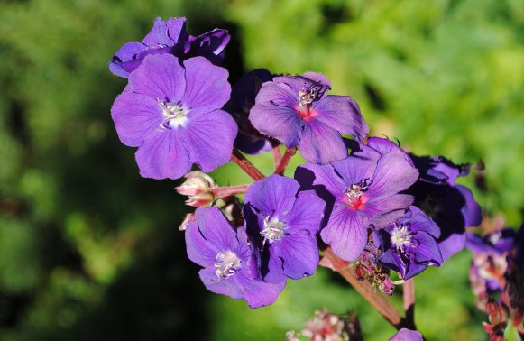
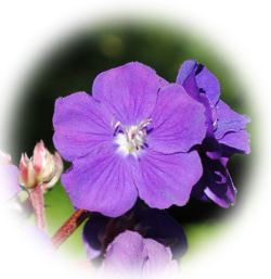 If you want to learn a little more about the power of selections, you might
try to make something like the image shown at the right. This image
was cut out of a larger image.
The effect around the border is achieved by making some pixels translucent.
This was done using the fact that pixels can be "partially selected."
Here is how to make a similar image:
If you want to learn a little more about the power of selections, you might
try to make something like the image shown at the right. This image
was cut out of a larger image.
The effect around the border is achieved by making some pixels translucent.
This was done using the fact that pixels can be "partially selected."
Here is how to make a similar image:
- Open a photographic image in Gimp.
- In the Layers dialog, right-click the Background layer and choose
"Add Alpha Channel" (if it is not already selected). This will allow you
to create an image with transparent sections.
- Make an elliptical -- or other -- selection containing the part of the
image that you want to cut out.) Note: After making the selection with
the Ellipse tool, you can adjust it by dragging the handles in the corners
or by dragging the selection itself.)
- Use the "Feather" command in the "Select" menu to soften the edge
of the selection. Feather the selection by about 40 pixels. This means
that instead of having a sharp boundary, the selection fades from fully
selected to partly selected to not selected over a distance of 40 pixels.
- Invert the selection, using the "Invert" command in the "Select" menu,
so that the outside of the ellipse is selected instead of the inside.
- Use the "Cut" command from the "Edit" menu to erase the selection.
- Draw a rectangular selection around the remaining image.
- Use the "Crop to Selection" command in the "Image" menu to discard the
part of the image outside the selected rectangle.
- Be sure to save the image in ".png" format (since jpeg doesn't support transparency).