Section 6.2
Component Classes
IN THIS SECTION, I will discuss various subclasses of the Component class. I will show how to create components belonging to these classes and I will discuss some of their methods. The events that can be generated by these components are discussed in Section 3. I'll also give an example there of an applet that uses many of these classes. The components discussed in this section are not containers; they cannot hold other components. Container classes were discussed in Section 1. Note that to use one of the components discussed in this section, you must add it to a container, such as an applet or panel, using one of the container's add() methods.
The Canvas Class
An object of type Canvas is just a rectangular patch on the screen. A object that belongs directly to the class Canvas -- as opposed to an object that belongs to one of its subclasses -- its not very useful. Such a canvas receives keyboard and mouse events but does nothing with them. It has a paint() method, but the paint() method doesn't draw anything. Generally, therefore, the Canvas class is only used as a basis for subclasses, and useful objects are created from the subclasses. A subclass of Canvas will generally override the paint() method and might also override event-handling methods for mouse and keyboard events such as mouseDown() and keyDown()
Just as with every component, the system will call a canvas's paint() method when the canvas needs to be redrawn. When the canvas's contents must be changed outside the paint() method, a graphics context for the canvas can be obtained by calling its getGraphics() method. All the graphics methods discussed in Section 5.4 can be used for a canvas.
It is possible to draw in any component, and it is common to draw directly on applets and windows. It would probably be considered good style, however, to restrict all drawing to subclasses of Canvas. In cases where only part of an applet or window is to be used for drawing, then the use of a canvas is almost unavoidable. This situation would arise, for example, if you wanted to have a drawing area with a row of buttons beneath it. The canvas, in this case, would be the Center component of a BorderLayout, as discussed in the previous section.
Canvas is the only class discussed in this section for which you have to define subclasses. For the remaining classes, you can simply create objects of the class directly.
The Label Class
Labels are certainly the simplest type of component. An object of type Label is just a single line of text. The text cannot be edited by the user, although it can be changed by your program. The constructor for a Label specifies the text to be displayed:
Label message = new Label("Hello World!");
You can change the text displayed in a label by calling the label's setText() method:
message.setText("Goodby World!");
Since the Label class is a subclass of Component, Labels inherit a lot of behavior from Components. In particular, a label has a foreground color, a background color, and a font. You can set these properties by calling methods defined in the Component class. Generally, you should do this just after the label is created.
           Label message = New Label("Hello World!");
           message.setForeground(Color.red);   // display red text...
           message.setBackground(Color.black); //    on a black background
           message.setFont(new Font("TimesRoman", Font.BOLD, 18));
The Button Class
An object of class Button is a push button. The user can press the button by clicking on it with the mouse. The button has a label that is specified when the button is created:
Button stopGoBttn = new Button("Go");
A button's label can be changed using its setLabel() method:
stopGoBttn.setLabel("Stop");
When the user clicks on a button, your program should respond by performing some action. The button itself responds by generating an event. Your program should detect this event and react to it, as discussed in the next section.
There might be times when a button should be disabled because the action that it represents is not legal or doesn't make sense. In that case, you can call the button's disable() method. This method stops the button from responding to events such as mouse clicks, and it changes the appearance of the button so the user can tell that it is disabled. To make the button active again, call the button's enable() method. These methods are actually defined in class Component and can be used for other types of components besides buttons.
The Checkbox and CheckboxGroup Classes
A Checkbox is a component that has two states: checked and unchecked. The user can change the state of a check box by clicking on it. The state of a checkbox is represented by a boolean value that is true if the box is checked and false if the box is unchecked. A checkbox has a label, which is specified when the box is constructed
Checkbox showTime = new Checkbox("Show Current Time");
The label of a checkbox can be set using its setLabel(String) method. Its current state can be set using its setState(boolean) method. For example, if you want the checkbox showTime to be checked, you would say "showTime.setState(true);". To uncheck the box, say "showTime.setState(false);". You can determine the current state of a checkbox by calling its getState() method, which returns a boolean value. If the state changes because the user clicks on the checkbox, an event is generated. Your program can detect and react to this event. Often, however, it is simpler to ignore such events and to check the state of the box using getState() whenever you need to know it.
Closely related to checkboxes are radio buttons. Radio buttons occur in groups. At most one radio button in a group can be checked at any given time. In Java, a radio button is just an object of type Checkbox that is part of such a group. An entire group of radio buttons is represented by an object belonging to the class CheckboxGroup. The class CheckBoxGroup has methods
            public void setCurrent(Checkbox box);
            public Checkbox getCurrent();
for selecting one of the checkboxes in the group, and for determining which box is currently selected. (The getCurrent() method will return null if none of the boxes in the group is currently selected.)
To create a group of radio buttons, you should first create an object of type CheckboxGroup. To create the individual buttons, use the constructor
Checkbox(String label, CheckboxGroup group, boolean state);
The third parameter of this constructor specifies the initial state of the checkbox. Remember that at most one of the checkboxes in the group can have its state set to true. For example:
          CheckboxGroup colorGroup = new CheckboxGroup();
          Checkbox red   = new Checkbox("Red", colorGroup, false);
          Checkbox blue  = new Checkbox("Blue", colorGroup, false);
          Checkbox green = new Checkbox("Green", colorGroup, true);
          Checkbox black = new Checkbox("Black", colorGroup, false);
This creates a group of four radio buttons labeled "Red", "Blue", "Green", and "Black". Initially, the third button is selected. You still have to add the Checkboxes, individually, to some container. The CheckboxGroup itself is not a component and cannot be added to a container. To actually use the buttons effectively in your program, you would presumably want to store either the CheckboxGroup object or the individual Checkbox objects in instance variables.
The Choice Class
A CheckBoxGroup is one way of allowing the user to select one option for a predetermined set of options. The Choice class represents another way of doing the same thing. An object of type Choice, however, presents the options in the form of a pop-up menu. The menu lists a number of items. Ordinarily, only the selected item is displayed. However, when the user clicks on the menu, the entire list is displayed, and the user can select one of the items from the list.
When a Choice object is first constructed, it initially has no items in it. Items are added using the method addItem(String). The countItems() method returns an int that gives the number of items in the list, and the method
public String getItem(int index)
gets the item in position number index in the list. (Items are numbered starting with zero, not one.) Other useful methods are:
          public int getSelectedIndex();
          public String getSelectedItem();
          public void select(int index);
          public void select(String itemName);
These methods serve the obvious purposes (noting that an item can be referred to either by its position in the list or by the actual text of the item).
For example, the following code will create an object of type Choice that contains the options Red, Blue, Green, and Black:
          Choice colorChoice = new Choice();
          colorChoice.addItem("Red");
          colorChoice.addItem("Blue");
          colorChoice.addItem("Green");
          colorChoice.addItem("Black");
The List Class
An object of type List is very similar to a Choice item. However, a List is presented on the screen as a scrolling list of items. Furthermore, you can create a List in which it is possible for the user to select more than one item in the list at the same time. The constructor for a List object takes the form
List(int itemsVisible, boolean multipleSelectionsAllowed);
The fist parameter tells how many items are visible in the list at one time; if the list contains more than this number of items, then the user can use a scroll bar to scroll through the list. The second parameter determines whether or not the user can select more than one item in the list at the same time.
The List class includes the addItem(String) method to add an item to the end of the list. You can also add an item in a specified position in the list using the addItem(String,int) method. (Items are numbered starting from zero.) The countItems() method returns an int giving the number of items in the list. The method delItem(int) deletes the item at a specified position. And the select(int) method can be used to select the item at the specified position in the list.
If exactly one item in the list is selected, then the method getSelectedIndex() will return the index of that item, and getSelectedItem() will return the item itself. However, if no items are selected or if more than one item is selected, then getSelectedIndex() will return -1, and getSelectedItem() will return null. In that case, you can use the methods getSelectedItems() and getSelectedIndexes() to determine which items are selected. (However, these two methods return "arrays", which I will not cover until Chapter 7.)
The TextField and TextArea Classes
TextFields and TextAreas are boxes where the user can type in and edit some text. The difference between them is that a TextField contains a single line of editable text, while a TextArea displays multiple lines and includes scroll bars that the user can use to scroll through the entire contents of the TextArea. (It is also possible to set a TextField or TextArea to be read-only, so that the user can read the text that it contains but not change it.)
Both TextField and TextArea are subclasses of TextCompontent, which is itself a subclass of Component. The TextComponent class supports the idea of a selection. A selection is a subset of the characters in the TextComponent, including all the characters from some starting position to some ending position. The selection is hilited on the screen. The user selects text by dragging the mouse over it. Some useful methods in class TextCompontent include the following. They can of course be used for both TextFields and TextAreas.
       public void setText(String newText);  // change the text
       public String getText();  // return a copy of the text
       public String getSelectedText();  // return the selected text
       public select(int start, int end);  // change the selected range;
           // characters in the range  start <= pos < end  are
           // selected; characters are numbered starting from zero
       public int getSelectionStart();  // get starting point of selection
       public int getSelectionEnd();  // get end point of selection
       public void setEditable(boolean canBeEdited);
          // determine whether or not the text in the component
          // can be edited by the user
The TextField class does not add any useful methods to this set. The constructor for a TextField takes the form
TextField(int columns);
where columns specifies the number of characters that should be visible in the text field. This is used to determine the width of the text field. (Because characters can be of different sizes, the number of characters visible in the text field might not be exactly equal to columns.) You don't have to specify the number of columns; for example, you might want the text field to expand to the maximum size available. In that case, you can use the constructor TextField(), with no parameters. You can also use the following constructors, which specify the initial contents of the text field:
         TextField(String contents);
         TextField(String contents, int columns);
The constructors for a TextArea are
         TextArea();
         TextArea(int lines, int columns);
         TextArea(String contents);
         TextArea(String contents, int lines, int columns);
The parameter lines specifies how many lines of text are visible in the text area. This determines the height of the text area. It is common to use a TextArea as the Center component of a BorderLayout. In that case, it isn't useful to specify the number of lines and columns, since the TextArea will expand to fill all the space available in the center area of the container.
The TextArea class adds a few useful procedures to those inherited from TextComponent:
         public void appendText(String text);
               // add the specified text at the end of the current contents
         public void insertText(String text, int pos);
               // insert the text, starting at specified position
         public void replaceText(String text, int start, int end);
               // delete the text from position start to position end
               //    and then insert the specified text in its place
The ScrollBar Class
Finally, we come to the ScrollBar class. Essentially, a ScrollBar allows the user to select an integer value from a range of values. A scroll bar can be either horizontal or vertical. It has five components:
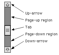
The position of the tab specifies the currently selected value. The user can move the tab by dragging it or by clicking on any of the other parts of the scroll bar. On some platforms, the size of the tab tells what portion of a scrolling region is currently visible.
A scroll bar has four associated integer values:
- min, which specifies the starting point of the range of possible values,
- max, which specifies the end point of the range of possible values,
- value, which gives the currently selected value, somewhere in the range between min and max, and
- visible, which specifies the size of the tab.
These values can be specified when the scroll bar is created. The constructor takes the form
Scrollbar(int orientation, int value, int visible, int min, int max);
The orientation, which specifies whether the scroll bar is horizontal or vertical, must be one of the constants Scrollbar.HORIZONTAL or Scrollbar.VERTICAL. You can set the value of the scroll bar at any time with the method setValue(int). If you want to set any of the other parameters, you have to set them all, using
public void setValues(int value, int visible, int min, int max);
Methods getValue(), getVisible(), getMinimum() and getMaximum() are provided for reading the current values of each of these parameters.
The remaining question is, how far does the tab move when the user clicks on the up-arrow or down-arrow or in the page-up or page-down region of a scrollbar? The amount by which the value changes when the user clicks on the up-arrow or down-arrow is called the line increment. The amount by which it changes when the user clicks in the page-up or page-down region is called the page increment. By default, both of these values are 1. They can be set using the methods:
         public void setLineIncrement(int lineIncrement);
         public void setPageIncrement(int pageIncrement);
Let's look at an example. Suppose that you want to use a very large canvas, which is too large to fit on the screen. You might decide to display only part of the canvas and to provide scroll bars to allow the user to scroll through the entire canvas. Let's say that the actual canvas is 1000 by 1000 pixels, and that you will show a 200-by-200 region of the canvas at any one time. Let's look at how you would set up the vertical scroll bar. The horizontal bar would be essentially the same.
The visible of the scroll bar would be 200, since that is how many pixels would actually be displayed. The value of the scroll bar would represent the vertical coordinate of the pixel that is at the top of the display. (Whenever the value changes, you have to redraw the display.) The minimum value would be 0, and the maximum would be 800. (The maximum would not be 1000, since when the scroll is at its maximum, the coordinate at the bottom of the display would be 1000. The coordinate at the top of the display would be 1000 - 200, or 800.)
The page increment for the scroll bar could be set to some value a little less than 200, say 190 or 175. Then, when the user clicks in the page-up or page-down region, the display will scroll by an amount almost equal to its size. The line increment could be left at 1, but it is likely that this would be too small. A line increment of 15 would make more sense, since then the display would scroll by 15 pixels when the user clicks the up-arrow or down-arrow. Of course, all these values would have to be reset if the display area is resized.
That's it. I've covered all the subclasses of Component, and I've mentioned many of the useful methods in those classes. It takes time to develop skill at using components. You should, as always, practice, experiment, and look elsewhere for more information when you need it.