Section 7.3
Basic Components and Their Events
THIS SECTION DISCUSSES some of the GUI interface elements that are represented by subclasses of JComponent. The treatment here is brief and covers only the basic uses of each component type. After you become familiar with the basics, you might want to consult a Java reference for more details. I will give some examples of programming with components in the next section.
The exact appearance of a Swing component and the way that the user interacts with the component are not fixed. They depend on the look-and-feel of the user interface. While Swing supports a default look-and-feel, which is probably the one that you will see most often, it is possible to change the look-and-feel. For example, a Windows look-and-feel could be used to make a Java program that is running on a Windows computer look more like a standard Windows program. While this can improve the user's experience, it means that some of the details that I discuss will have to be qualified with the phrase "depending on the look-and-feel."
The JComponent class itself defines many useful methods that can be used with components of any type. We've already used some of these in examples. Let comp be a variable that refers to any JComponent. Then the following methods are available (among many others):
- comp.getSize() is a function that returns an object belonging to the class Dimension. This object contains two instance variables, comp.getSize().width and comp.getSize().height, that give the current size of the component. You can also get the height and width more directly by calling comp.getHeight() and comp.getWidth(). One warning: When a component is first created, its size is zero. The size will be set later, probably by a layout manager. A common mistake is to check the size of a component before that size has been set, such as in a constructor.
- comp.setEnabled(true) and comp.setEnabled(false) can be used to enable and disable the component. When a component is disabled, its appearance changes, and the user cannot do anything with it. There is a boolean-valued function, comp.getEnabled() that you can call to discover whether the component is enabled.
- comp.setVisible(true) and comp.setVisible(false) can be called to hide or show the component.
- comp.setBackground(color) and comp.setForeground(color) set the background and foreground colors for the component. If no colors are set for a component, the colors are determined by the look-and-feel.
- comp.setOpaque(true) tells the component that the area occupied by the component should be filled with the component's background color before the content of the component is painted. In the default look-and-feel, only JLabels are non-opaque. A non-opaque, or "transparent", component ignores its background color and simply paints its content over the content of its container. This usually means that it inherits the background color from its container.
- comp.setFont(font) sets the font that is used for text displayed on the component. The parameter is an object of type java.awt.Font.
- comp.setToolTipText(string) sets the specified string as a "tool tip" for the component. The tool tip is displayed if mouse cursor is in the component and the mouse is not moved for a few seconds. The tool tip should give some information about the meaning of the component or how to use it.
- comp.setCursor(cursor) sets the cursor image that represents the mouse position when the mouse cursor is inside this component. The parameter is an object belonging to the class java.awt.Cursor. Generally, this parameter takes the form Cursor.getPredefinedCursor(id) where id is one of several constants defined in the Cursor class. The most useful values are probably Cursor.HAND_CURSOR, Cursor.CROSSHAIR_CURSOR, Cursor.WAIT_CURSOR, and Cursor.DEFAULT_CURSOR. For example, if you would like the cursor to appear as a little pointing hand when the mouse is in the component comp, you can use: comp.setCursor(Cursor.getPredefinedCursor(Cursor.HAND_CURSOR));
- comp.setPreferredSize(size) sets the size at which the component should be displayed, if possible. The parameter is of type Dimension, and a call to this method usually looks something like "setPreferredSize(new Dimension(100,50))". The preferred size is used as a hint by layout managers, but will not be respected in all cases. In a BorderLayout, for example, the preferred size of the Center component is irrelevant, but the preferred sizes of the North, South, East, and West components are used by the layout manager to decide how much space to allow for those components. Standard components generally compute a correct preferred size automatically, but it can be useful to set it in some cases. For example, if you use a JPanel as a drawing surface, it might be a good idea to set a preferred size for it.
- comp.getParent() is a function that returns a value of type java.awt.Container. The return value is the container that directly contains the component, if any. For a top-level component such as a JApplet, the value will be null.
- comp.getLocation() is a function that returns the location of the top-left corner of the component. The location is specified in the coordinate system of the component's parent. The returned value is an object of type Point. An object of type Point contains two instance variables, x and y.
For the rest of this section, we'll look at subclasses of JComponent that represent common GUI components. Remember that using any component is a multi-step process. The component object must be created with a constructor. It must be added to a container. In many cases, a listener must be registered to respond to events from the component. And in some cases, a reference to the component must be saved in an instance variable so that the component can be manipulated by the program after it has been created.
The JButton Class
An object of class JButton is a push button. You've already seen buttons used in the previous chapter, but we can use a review of JButtons as a reminder of what's involved in using components, events, and listeners. (Some of the methods described here are new.)
- Constructors: The JButton class has a constructor that takes a string as a parameter. This string becomes the text displayed on the button. For example: stopGoButton = new JButton("Go")
- Events: When the user clicks on a button, the button generates an event of type ActionEvent. This event is sent to any listener that has been registered with the button.
- Listeners: An object that wants to handle events generated by buttons must implement the ActionListener interface. This interface defines just one method, "pubic void actionPerformed(ActionEvent evt)", which is called to notify the object of an action event.
- Registration of Listeners: In order to actually receive notification of an event from a button, an ActionListener must be registered with the button. This is done with the button's addActionListener() method. For example: stopGoButton.addActionListener(buttonHandler);
- Event methods: When actionPerformed(evt) is called by the button, the parameter, evt, contains information about the event. This information can be retrieved by calling methods in the ActionEvent class. In particular, evt.getActionCommand() returns a String giving the command associated with the button. By default, this command is the text that is displayed on the button. The method evt.getSource() returns a reference to the Object that produced the event, that is, to the JButton that was pressed. The return value is of type Object, not JButton, because other types of components can also produce ActionEvents.
- Component methods: There are several useful methods in the JButton class. For example, stopGoButton.setText("Stop") changes the text displayed on the button to "Stop". And stopGoButton.setActionCommand("sgb") changes the action command associated to this button for action events.
Of course, JButtons also have all the general Component methods, such as setEnabled() and setFont(). The setEnabled() and setText() methods of a button are particularly useful for giving the user information about what is going on in the program. A disabled button is better than a button that gives an obnoxious error message such as "Sorry, you can't click on me now!"
By the way, it's possible for a JButton to display an icon instead of or in addition to the text that it displays. An icon is simply a small image. Several other components can also display icons. However, I will not cover this aspect of Swing in this book. Consult a Java reference if you are interested.
The JLabel Class
JLabels are certainly the simplest type of component. An object of type JLabel is just a single line of text. The text cannot be edited by the user, although it can be changed by your program. The constructor for a JLabel specifies the text to be displayed:
JLabel message = new JLabel("Hello World!");
There is another constructor that specifies where in the label the text is located, if there is extra space. The possible alignments are given by the constants JLabel.LEFT, JLabel.CENTER, and JLabel.RIGHT. For example,
JLabel message = new JLabel("Hello World!", JLabel.CENTER);
creates a label whose text is centered in the available space. You can change the text displayed in a label by calling the label's setText() method:
message.setText("Goodby World!");
Since the JLabel class is a subclass of Component, you can use methods such as setForeground() with labels. If you want the background color to have any effect, you should call setOpaque(true) on the label, since otherwise the JLabel might not fill in its background (depending on the look-and-feel). For example:
      JLabel message = new JLabel("Hello World!");
      message.setForeground(Color.red);   // Display red text...
      message.setBackground(Color.black); //    on a black background...
      message.setFont(new Font("Serif",Font.BOLD,18));  // in a bold font.
      message.setOpaque(true);  // Make sure background is filled in.
The JCheckBox Class
A JCheckBox is a component that has two states: selected or unselected. The user can change the state of a check box by clicking on it. The state of a checkbox is represented by a boolean value that is true if the box is selected and false if the box is unselected. A checkbox has a label, which is specified when the box is constructed:
JCheckBox showTime = new JCheckBox("Show Current Time");
Usually, it's the user who sets the state of a JCheckBox, but you can also set the state in your program. The current state of a checkbox is set using its setSelected(boolean) method. For example, if you want the checkbox showTime to be checked, you would say "showTime.setSelected(true);". To uncheck the box, say "showTime.setSelected(false);". You can determine the current state of a checkbox by calling its isSelected() method, which returns a boolean value.
In many cases, you don't need to worry about events from checkboxes. Your program can just check the state whenever it needs to know it by calling the isSelected() method. However, a checkbox does generate an event when its state changes, and you can detect this event and respond to it if you want something to happen at the moment the state changes. When the state of a checkbox is changed by the user, it generates an event of type ActionEvent. If you want something to happen when the user changes the state of a checkbox, you must register an ActionListener with the checkbox. (Note that if you change the state by calling the setSelected() method, no ActionEvent is generated. However, there is another method in the JCheckBox class, doClick(), which simulates a user click on the checkbox and does generate an ActionEvent.)
When handling an ActionEvent, you can call evt.getSource() in the actionPerformed() method to find out which object generated the event. (Of course, if you are only listening for events from one component, you don't even have to do this.) The returned value is of type Object, but you can type-cast it to another type if you want. Once you know the object that generated the event, you can ask the object to tell you its current state. For example, if you know that the event had to come from one of two checkboxes, cb1 or cb2, then your actionPerformed() method might look like this:
          public void actionPerformed(ActionEvent evt) {
             Object source = evt.getSource();
             if (source == cb1) {
                boolean newState = ((JCheckBox)cb1).isSelected();
                ... // respond to the change of state
             }
             else if (source == cb2) {
                boolean newState = ((JCheckBox)cb2).isSelected();
                ... // respond to the change of state
             }
          }
Alternatively, you can use evt.getActionCommand() to retrieve the action command associated with the source. For a JCheckBox, the action command is, by default, the label of the checkbox.
The JRadioButton and ButtonGroup Classes
Closely related to checkboxes are radio buttons. Radio buttons occur in groups. At most one radio button in a group can be selected at any given time. In Java, a radio button is represented by an object of type JRadioButton. When used in isolation, a JRadioButton acts just like a JCheckBox, and it has the same methods and events. Ordinarily, however, a JRadioButton is used in a group. A group of radio buttons is represented by an object belonging to the class ButtonGroup. A ButtonGroup is not a component and does not itself have a visible representation on the screen. A ButtonGroup works behind the scenes to organize a group of radio buttons, so that at most one button in the group can be selected at any given time.
To use a group of radio buttons, you must create a JRadioButton object for each button in the group, and you must create one object of type ButtonGroup to organize the individual buttons into a group. Each JRadioButton must be added individually to some container, so that it will appear on the screen. (A ButtonGroup plays no role in the placement of the buttons on the screen.) Each JRadioButton must also be added to the ButtonGroup, which has an add() method for this purpose. If you want one of the buttons to be selected at start-up, you can call setSelected(true) for that button. If you don't do this, then none of the buttons will be selected until the user clicks on one of them.
As an example, here is how you could set up a set of radio buttons that can be used to select a color:
          JRadioButton redRadio, blueRadio, greenRadio, blackRadio;
                   // Variables to represent the radio buttons.
                   // These should probably be instance variables, so
                   // that they can be used throughout the program.

          ButtonGroup colorGroup = new ButtonGroup();

          redRadio = new JRadioButton("Red");  // Create a button.
          colorGroup.add(redRadio);    // Add it to the group.

          blueRadio = new JRadioButton("Blue");
          colorGroup.add(blueRadio);

          greenRadio = new JRadioButton("Green");
          colorGroup.add(greenRadio);

          blackRadio = new JRadioButton("Black");
          colorGroup.add(blackRadio);

          redRadio.setSelected(true);  // Make an initial selection.
The individual buttons must still be added to a container if they are to appear on the screen. If you want to respond immediately when the user clicks on one of the radio buttons, you should register an ActionListener for each button. Here is an applet that demonstrates this. When you click one of the radio buttons, the background color of the label is changed:
The source code for the applet is in the file RadioButtonDemo.java. Just as for checkboxes, it is not always necessary to register listeners for radio buttons. In many cases, you can simply check the state of each button when you need to know it, using the isSelected() method.
The JComboBox Class
The JComboBox class represents another way of letting the user select one option from a list of options. But in this case, the options are presented as a kind of pop-up menu, and only the currently selected option is visible on the screen. The painting applet at the end of Section 6.6 used a JComboBox for selecting a color.
When a JComboBox object is first constructed, it initially contains no items. An item is added to the bottom of the menu by calling its instance method, addItem(str), where str is a string that will be displayed. (In fact, you can add any type of object to a JComboBox. The toString() method of the object is called to determine what string to display.)
For example, the following code will create an object of type JComboBox that contains the options Red, Blue, Green, and Black:
          JComboBox colorChoice = new JComboBox();
          colorChoice.addItem("Red");
          colorChoice.addItem("Blue");
          colorChoice.addItem("Green");
          colorChoice.addItem("Black");
You can call the getSelectedIndex() method of a JComboBox to find out which item is currently selected. This method returns an integer that gives the position of the selected item in the list, where the items are numbered starting from zero. Alternatively, you can call getSelectedItem() to get the selected item itself. (This method returns a value of type Object.) You can change the selection by calling the method setSelectedIndex(n), where n is an integer giving the position of the item that you want to select.
The most common way to use a JComboBox menu is to call its getSelectedIndex() method when you have a need to know which item is currently selected. However, like other components that we have seen, JComboBox components generate ActionEvents. You can register an ActionListener with the JComboBox if you want to respond to such events as they occur.
JComboBoxes have a nifty feature, which is probably not all that useful in practice. You can make a JComboBox "editable" by calling its method setEditable(true). If you do this, the user can edit the selection by clicking on the JComboBox and typing. This allows the user to make a selection that is not in the pre-configured list that you provide. (The "Combo" in the name "JComboBox" refers to the fact that it's a kind of combination of menu and text-input box.) If the user has edited the selection in this way, then the getSelectedIndex() method will return the value -1, and getSelectedItem() will return the string that the user typed. An ActionEvent is triggered if the user presses return in the JComboBox.
The JSlider Class
A JSlider provides a way for the user to select an integer value from a range of possible values. The user does this by dragging a "knob" along a bar. A slider can, optionally, be decorated with tick marks and with labels. This demonstration applet shows three sliders with different decorations and with different ranges of values:
In this applet, the second slider is decorated with ticks, and the third one is decorated with labels. It's possible for a single slider to have both types of decorations.
The most commonly used constructor for JSliders specifies the start and end of the range of values for the slider and its initial value when it first appears on the screen:
JSlider(int minimum, int maximum, int value)
If the parameters are omitted, the values 0, 100, and 50 are used. By default, a slider is horizontal, but you can make it vertical by calling its method setOrientation(JSlider.VERTICAL). The current value of a JSlider can be read at any time with its getValue() method. This method returns a value of type int. If you want to change the value, you can do so with the method setValue(n), which takes a parameter of type int.
If you want to respond immediately when the user changes the value of a slider, you can register a listener with the slider. JSliders, unlike other components we have seen, do not generate ActionEvents. Instead, they generate events of type ChangeEvent. ChangeEvent and related classes are defined in the package javax.swing.event rather than java.awt.event, so if you want to use ChangeEvents, you should import javax.swing.event.* at the beginning of your program. You must also define some object to implement the ChangeListener interface, and you must register the change listener with the slider by calling its addChangeListener() method. A ChangeListener must provide a definition for the method:
void stateChanged(ChangeEvent evt)
This method will be called whenever the value of the slider changes. (Note that it will be called when you change the value with the setValue() method, as well as when the user changes the value.) In the stateChanged() method, you can call evt.getSource() to find out which object generated the event.
Using tick marks on a slider is a two-step process: Specify the interval between the tick marks, and tell the slider that the tick marks should be displayed. There are actually two types of tick marks, "major" tick marks and "minor" tick marks. You can have one or the other or both. Major tick marks are a bit longer than minor tick marks. The method setMinorTickSpacing(i) indicates that there should be a minor tick mark every i units along the slider. The parameter is an integer. (The spacing is in terms of values on the slider, not pixels.) For the major tick marks, there is a similar command, setMajorTickSpacing(i). Calling these methods is not enough to make the tick marks appear. You also have to call setPaintTicks(true). For example, the second slider in the above applet was created and configured using the commands:
            slider2 = new JSlider();
            slider2.addChangeListener(this);
            slider2.setMajorTickSpacing(25);
            slider2.setMinorTickSpacing(5);
            slider2.setPaintTicks(true);
            getContentPane().add(slider2);
Labels on a slider are handled similarly. You have to specify the labels and tell the slider to paint them. Specifying labels is a tricky business, but the JSlider class has a method to simplify it. Create a set of labels and add them to a slider named sldr with the command:
sldr.setLabelTable( sldr.createStandardLabels(i) );
where i is an integer giving the spacing between the labels. To arrange for the labels to be displayed, call setPaintLabels(true). For example, the third slider in the above applet was created and configured with the commands:
            slider3 = new JSlider(2000,2100,2002);
            slider3.addChangeListener(this);
            slider3.setLabelTable(slider3.createStandardLabels(50));
            slider3.setPaintLabels(true);
            getContentPane().add(slider3);
JScrollBar and JScrollPane
A JScrollBar, like a JSlider, allows the user to select an integer value from a range of values. A scroll bar, however, is generally used to control the scrolling of another component such as the text in a text editor. A scroll bar can be either horizontal or vertical. It has five parts:
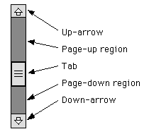
The position of the tab specifies the currently selected value. The user can move the tab by dragging it or by clicking on any of the other parts of the scroll bar. The size of the tab tells what portion of a scrolling region is currently visible. It is actually the position of the bottom or left edge of the tab that represents the currently selected value.
A scroll bar has four associated integer values:
- min, which specifies the starting point of the range of values represented by the scrollbar, corresponding to the left or bottom edge of the bar
- max, which specifies the end point of the range of values, corresponding to the right or top edge of the bar
- visible, which specifies the size of the tab
- value, which gives the currently selected value, somewhere in the range between min and (max - visible).
Note that the largest possible value is (max - visible), not max, since the value represents the position of the left or bottom edge of the tab. The largest possible value allows space for the tab, whose size is given by visible.
The four values can be specified when the scroll bar is created. The constructor takes the form
JScrollBar(int orientation, int value, int visible, int min, int max);
The orientation, which specifies whether the scroll bar is horizontal or vertical, must be one of the constants JScrollBar.HORIZONTAL or JScrollBar.VERTICAL. The value must be between min and (max - visible). You can leave out all the int parameters to get a scroll bar with default values. You can set the value of the scroll bar at any time with the method setValue(int). Similarly, the other values can be set with setMinimum(int), setMaximum(int), and setVisibleAmount(int). You can also set all four values at once by calling:
void setValues(int value, int visible, int min, int max);
Methods getValue(), getVisibleAmount(), getMinimum() and getMaximum() are provided for reading the current values of each of these parameters.
The user can drag the tab or click elsewhere on the scroll bar. How far does the tab move when the user clicks on the up-arrow or down-arrow or in the page-up or page-down region of a scrollbar? The amount by which the value changes when the user clicks on the up-arrow or down-arrow is called the unit increment. The amount by which it changes when the user clicks in the page-up or page-down region is called the block increment. By default, both of these values are 1. They can be set using the methods:
         void setUnitIncrement(int unitIncrement);
         void setBlockIncrement(int blockIncrement);
Let's look at an example. Suppose that you want to use a very large drawing area, which is too large to fit on the screen. You might decide to display only part of the JPanel and to provide scroll bars to allow the user to scroll through the entire panel. Let's say that the actual panel is 1000 by 1000 pixels, and that you will show a 200-by-200 region of the panel at any one time. Let's look at how you would set up the vertical scroll bar. The horizontal bar would be essentially the same.
The visible of the scroll bar would be 200, since that is how many pixels would actually be displayed. The value of the scroll bar would represent the vertical coordinate of the pixel that is at the top of the display. (Whenever the value changes, you have to redraw the display.) The min would be 0, and the max would be 1000. The range of values that can be set on the scroll bar is from 0 to 800. (Remember that the largest possible value is the maximum minus the visible amount.)
The page increment for the scroll bar could be set to some value a little less than 200, say 190 or 175. Then, when the user clicks in the page-up or page-down region, the display will scroll by an amount almost equal to its size. The line increment could be left at 1, but it is likely that this would be too small since it represents a scrolling increment of just one pixel. A line increment of 15 would be better, since then the display would scroll by a more reasonable 15 pixels when the user clicks the up-arrow or down-arrow. (Of course, all these values would have to be reset if the display area is resized.)
A scroll bar generates an event of type AdjustmentEvent whenever the user changes the value of the scroll bar. The associated AdjustmentListener interface defines one method, "adjustmentValueChanged(AdjustmentEvent evt)", which is called by the scroll bar to notify the listener that the value on the scroll bar has been changed. This method should repaint the display or make whatever other change is appropriate for the new value. The method evt.getValue() returns the current value on the scroll bar. If you are using more than one scroll bar and need to determine which scroll bar generated the event, use evt.getSource() to determine the source of the event.
Scrolling is complicated. Fortunately, Swing provides a class that can take care of many of the details. A JScrollPane is is a component that provides scrolling for another component. That component is specified as a parameter to the constructor:
JScrollPane(Component content)
The content component appears in the center of the scroll pane. If it is too large to be displayed entirely, then horizontal and/or vertical scroll bars will appear that can be used for scrolling the content. You have to add the scroll pane to a container to make both the scroll pane and its content appear on the screen. This makes scrolling very easy, and makes it unusual to work with scroll bars directly.
A JScrollPane can use any component as content, but several Swing components, including the JTextArea that will be discussed below, are designed specifically to work with JScrollPane.
The JTextField and JTextArea Classes
JTextFields and JTextAreas are boxes where the user can type in and edit text. The difference between them is that a JTextField contains a single line of editable text, while a JTextArea can display multiple lines. It is also possible to set a JTextField or JTextArea to be read-only so that the user can read the text that it contains but cannot edit the text.
Both JTextField and JTextArea are subclasses of javax.swing.text.JTextComponent, which defines their common behavior. The JTextComponent class supports the idea of a selection. A selection is a subset of the characters in the JTextComponent, including all the characters from some starting position to some ending position. The selection is hilited on the screen. The user selects text by dragging the mouse over it. Some useful methods in class JTextComponent include the following. They can, of course, be used for both JTextFields and JTextAreas.
        void setText(String newText);  // substitute newText
                                       //   for current contents
        String getText();  // return a copy of the current contents
        String getSelectedText();  // return the selected text
        void select(int start, int end);  // change the selection;
           // characters in the range  start <= pos < end  are
           // selected; characters are numbered starting from zero
        void selectAll();  // select the entire text
        int getSelectionStart();  // get starting point of selection
        int getSelectionEnd();  // get end point of selection
        void setEditable(boolean canBeEdited);
          // specify whether or not the text in the component
          // can be edited by the user
The requestFocus() method, inherited from JComponent, is also useful for text components. The constructor for a JTextField takes the form
JTextField(int columns);
where columns specifies the number of characters that should be visible in the text field. This is used to determine the preferred width of the text field. (Because characters can be of different sizes, the number of characters visible in the text field might not be exactly equal to columns.) You don't have to specify the number of columns; for example, you might use the text field in a context where it will expand to the maximum size available. In that case, you can use the constructor JTextField(), with no parameters. You can also use the following constructors, which specify the initial contents of the text field:
         JTextField(String contents);
         JTextField(String contents, int columns);
JTextField has a subclass, JPasswordField, which is identical except that it does not reveal the text that it contains. The characters in a JPasswordField are all displayed as asterisks (or some other fixed character). A password field is, obviously, designed to let the user enter a password without showing that password on the screen.
The constructors for a JTextArea are
         JTextArea();
         JTextArea(int lines, int columns);
         JTextArea(String contents);
         JTextArea(String contents, int lines, int columns);
The parameter lines specifies how many lines of text should be visible in the text area. This determines the preferred height of the text area. (The text area can actually contain any number of lines; the text area can be scrolled to reveal lines that are not currently visible.) It is common to use a JTextArea as the Center component of a BorderLayout. In that case, it isn't useful to specify the number of lines and columns, since the TextArea will expand to fill all the space available in the center area of the container.
The JTextArea class adds a few useful procedures to those inherited from JTextComponent:
         void append(String text);
               // add the specified text at the end of the current
               // contents; line breaks can be inserted by using the
               // special character \n
         void insert(String text, int pos);
               // insert the text, starting at specified position
         void replaceRange(String text, int start, int end);
               // delete the text from position start to position end
               //    and then insert the specified text in its place
         void setLineWrap(boolean wrap);
               // If wrap is true, then a line that is too long to be
               // displayed in the text area will be "wrapped" onto
               // the next line.  The default value is false.
A JTextField generates an ActionEvent when the user presses return while typing in the JTextField. The JTextField class includes an addActionListener() method that can be used to register a listener with a JTextField. In the actionPerformed() method, the evt.getActionCommand() method will return a copy of the text from the JTextField. It is also common to use a JTextField by checking its contents, when needed, with the getText() method. JTextAreas do not generate action events.
A JTextArea does not have scroll bars, but scroll bars can be added easily by putting the text area in a scroll pane:
            JTextArea inputArea = new JTextArea();
            JScrollPane scroller = new JScrollPane( inputArea );
The scroll bars will appear only when needed. Remember to add the scroll pane, not the text area, to a container.
Other Components
This section has introduced many, but not all, Swing components. We will look at menus and menu bars in Section 5. Some Swing components will not be covered at all. These include:
- JList -- displays a list of items to the user, and allows the user to select one or several items from the list.
- JTable -- displays a two-dimensional table of items, and possibly allows the user to edit them.
- JTree -- displays hierarchical data in a tree-like structure.
- JToolBar -- holds a row of tools, such as icons and buttons. The user can drag the tool bar away from the window that contains it, and it becomes a separate, floating tool window.
- JSplitPane -- a container that displays two components. The user can drag the dividing line between the components to adjust their relative sizes.
- JTabbedPane -- a container that displays one of a set of panels. The user selects which panel is visible by clicking on a "tab" at the top of the pane.