Section 13.3
Actions and Buttons
For the past two sections, we have been looking at some of the more advanced aspects of the Java graphics API. But the heart of most graphical user interface programming is using GUI components. In this section and the next, we'll be looking at JComponents. We'll cover several component classes that were not covered in Chapter 6, as well as some additional features of classes that were covered there.
This section is mostly about buttons. Buttons are among the simplest of GUI components, and it seems like there shouldn't be all that much to say about them. However, buttons are not as simple as they seem. For one thing, there are many different types of buttons. The basic functionality of buttons in Java is defined by the class javax.swing.AbstractButton. Subclasses of this class represent push buttons, check boxes, and radio buttons. Menu items are also considered to be buttons. The AbstractButton class defines a surprisingly large API for controlling the appearance of buttons. This section will cover part of that API, but you should see the class documentation for full details.
In this section, we'll also encounter a few classes that do not themselves define buttons but that are related to the button API, starting with "actions."
13.3.1 Action and AbstractAction
The JButton class represents push buttons. Up until now, we have created push buttons using the constructor
public JButton(String text);
which specifies text that will appear on the button. We then added an ActionListener to the button, to respond when the user presses it. Another way to create a JButton is using an Action. The Action interface represents the general idea of some action that can be performed, together with properties associated with that action, such as a name for the action, an icon that represents the action, and whether the action is currently enabled or disabled. Actions are usually defined using the class AbstractAction, an abstract class which includes a method
public void actionPerformed(ActionEvent evt)
that must be defined in any concrete subclass. Often, this is done in an anonymous inner class. For example, suppose that display is an object that has a clear() method. Then an Action object that represents the action "clear the display" can be defined as:
Action clearAction = new AbstractAction("Clear") {
   public void actionPerformed(ActionEvent evt) {
      display.clear();
   }
};
The parameter, "Clear", in the constructor of the AbstractAction is the name of the action. Other properties can be set by calling the method putValue(key,value), which is part of the Action interface. For example,
clearAction.putValue(Action.SHORT_DESCRIPTION, "Clear the Display");
sets the SHORT_DESCRIPTION property of the action to have the value "Clear the Display". The key parameter in the putValue() method is usually given as one of several constants defined in the Action interface. As another example, you can change the name of an action by using Action.NAME as the key in the putValue() method.
Once you have an Action, you can use it in the constructor of a button. For example, using the action clearAction defined above, we can create the JButton
JButton clearButton = new JButton( clearAction );
The name of the action will be used as the text of the button, and some other properties of the button will be taken from properties of the action. For example, if the SHORT_DESCRIPTION property of the action has a value, then that value is used as the tooltip text for the button. (The tooltip text appears when the user hovers the mouse over the button.) Furthermore, when you change a property of the action, the corresponding property of the button will also be changed. For example, changing the Action's property associated with the key Action.NAME will also change the text on the button.
The Action interface defines a setEnabled() method that is used to enable and disable the action. The clearAction action can be enabled and disabled by calling clearAction.setEnabled(true) and clearAction.setEnabled(false). When you do this, any button that has been created from the action is also enabled or disabled at the same time.
Now of course, the question is, why should you want to use Actions at all? One advantage is that using actions can help you to organize your code better. You can create separate objects that represent each of the actions that can be performed in your program. This represents a nice division of responsibility. Of course, you could do the same thing with individual ActionListener objects, but then you couldn't associate descriptions and other properties with the actions.
More important is the fact that Actions can also be used in other places in the Java API. You can use an Action to create a JMenuItem in the same way as for a JButton:
JMenuItem clearCommand = new JMenuItem( clearAction );
A JMenuItem, in fact, is a kind of button and shares many of the same properties that a JButton can have. You can use the same Action to create both a button and a menu item (or even several of each if you want). Whenever you enable or disable the action or change its name, the button and the menu item will both be changed to match. If you change the NAME property of the action, the text of both the menu item and the button will be set to the new name of the action. If you disable the action, both menu item and button will be disabled. You can think of the button and the menu items as being two presentations of the Action, and you don't have to keep track of the button or menu item after you create them. You can do everything that you need to do by manipulating the Action object.
By the way, if you want to add a menu item that is defined by an Action to a menu, you don't even need to create the JMenuItem yourself. You can add the action object directly to the menu, and the menu item will be created from the properties of the action. For example, if menu is a JMenu and clearAction is an Action, you can simply say menu.add(clearAction).
Actions have some other useful properties that we will encounter later in this section.
13.3.2 Icons on Buttons
In addition to -- or instead of -- text, buttons can also show icons. Icons are represented by the Icon interface and are usually created as ImageIcons, as discussed in Subsection 13.1.4. For example, here is a picture of a button that displays an image of a large "X" as its icon:
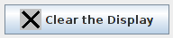
The icon for a button can be set by calling the button's setIcon() method, or by passing the icon object as a parameter to the constructor when the button is created. To create the button shown above, I created an ImageIcon from a BufferedImage on which I drew the picture that I wanted, and I constructed the JButton using a constructor that takes both the text and the icon for the button as parameters. Here's the code segment that does it:
BufferedImage image = new BufferedImage(24,24,BufferedImage.TYPE_INT_RGB);

Graphics2D g2 = (Graphics2D)image.getGraphics();
g2.setColor(Color.LIGHT_GRAY);             // Draw the image for the icon.
g2.fillRect(0,0,24,24);
g2.setStroke( new BasicStroke(3) );        //    Use thick lines.
g2.setColor(Color.BLACK);
g2.drawLine(4,4,20,20);                    //    Draw the "X".
g2.drawLine(4,20,20,4);
g2.dispose();

Icon clearIcon = new ImageIcon(image);     // Create the icon.

JButton clearButton = new JButton("Clear the Display", clearIcon);
You can create a button with an icon but no text by using a constructor that takes just the icon as parameter. Another alternative is for the button to get its icon from an Action. When a button is constructed from an action, it takes its icon from the value of the action property Action.SMALL_ICON. For example, suppose that we want to use an action named clearAction to create the button shown above. This could be done with:
clearAction.putValue( Action.SMALL_ICON, clearIcon );
JButton clearButton = new JButton( clearAction );
The icon could also be associated with the action by passing it as a parameter to the constructor of an AbstractAction:
Action clearAction = new AbstractAction("Clear the Display", clearIcon) {
   public void actionPerformed(ActionEvent evt) {
      .
      .  // Carry out the action.
      .
   }
}
JButton clearButton = new JButton( clearAction );
The SMALL_ICON for an Action will also be used by a JMenuItem created from the action. (An action can also have an icon associated with the key Action.LARGE_ICON_KEY. If it does, then a JButton will use the "large" icon in preference to the "small" icon. However, a JMenuItem will only use a small icon.)
The appearance of buttons can be tweaked in many ways. For example, you can change the size of the gap between the button's text and its icon. You can associate additional icons with a button that are used when the button is in certain states, such as when it is pressed or when it is disabled. It is even possible to change the positioning of the text with respect to the icon. For example, to place the text centered below the icon on a button, you can say:
button.setHorizontalTextPosition(JButton.CENTER);
button.setVerticalTextPosition(JButton.BOTTOM);
These methods and many others are defined in the class AbstractButton. This class is a superclass for JMenuItem, as well as for JButton and for the classes that define check boxes and radio buttons.
Finally, I will mention that it is possible to use icons on JLabels in much the same way that they can be used on JButtons. Placing an ImageIcon on a JLabel can be a convenient way to add a static image to your GUI.
13.3.3 Making Choices
The JCheckBox class was covered in Subsection 6.5.3, and the equivalent for use in menus, JCheckBoxMenuItem, in Subsection 6.7.1. A checkbox lets the user make a choice between two alternatives. A checkbox has two states, selected and not selected, and the user can change the state by clicking on the check box. The state of a checkbox can also be set programmatically by calling its setSelected() method, and the current value of the state can be checked using the isSelected() method.
Closely related to checkboxes are radio buttons. Like a checkbox, a radio button can be either selected or not. However, radio buttons are expected to occur in groups, and at most one radio button in a group can be selected at any given time. Radio button groups let the user make a choice among several alternatives. In Java, a radio button is represented by an object of type JRadioButton. When used in isolation, a JRadioButton acts just like a JCheckBox, and it has the same methods and events. Ordinarily, however, a JRadioButton is used in a group. A group of radio buttons is represented by an object belonging to the class ButtonGroup. A ButtonGroup is not a component and does not itself have a visible representation on the screen. A ButtonGroup works behind the scenes to organize a group of radio buttons, to ensure that at most one button in the group can be selected at any given time.
To use a group of radio buttons, you must create a JRadioButton object for each button in the group, and you must create one object of type ButtonGroup to organize the individual buttons into a group. Each JRadioButton must be added individually to some container, so that it will appear on the screen. (A ButtonGroup plays no role in the placement of the buttons on the screen.) Each JRadioButton must also be added to the ButtonGroup, which has an add() method for this purpose. If you want one of the buttons to be selected initially, you can call setSelected(true) for that button. If you don't do this, then none of the buttons will be selected until the user clicks on one of them.
As an example, here is how you could set up a set of radio buttons that can be used to select a color:
JRadioButton redRadio, blueRadio, greenRadio, yellowRadio;
         // Variables to represent the radio buttons.
         // These should probably be instance variables, so
         // that they can be used throughout the program.

ButtonGroup colorGroup = new ButtonGroup();

redRadio = new JRadioButton("Red");  // Create a button.
colorGroup.add(redRadio);            // Add it to the group.

blueRadio = new JRadioButton("Blue");
colorGroup.add(blueRadio);

greenRadio = new JRadioButton("Green");
colorGroup.add(greenRadio);

yellowRadio = new JRadioButton("Yellow");
colorGroup.add(yellowRadio);

redRadio.setSelected(true);  // Make an initial selection.
The individual buttons must still be added to a container if they are to appear on the screen. If you want to respond immediately when the user clicks on one of the radio buttons, you can register an ActionListener for each button. Just as for checkboxes, it is not always necessary to register listeners for radio buttons. In some cases, you can simply check the state of each button when you need to know it, using the button's isSelected() method.
You can add the equivalent of a group of radio buttons to a menu by using the class JRadioButtonMenuItem. To use this class, create several objects of this type, and create a ButtonGroup to manage them. Add each JRadioButtonMenuItem to the ButtonGroup, and also add them to a JMenu. If you want one of the items to be selected initially, call its setSelected() method to set its selection state to true. You can add ActionListeners to each JRadioButtonMenuItem if you need to take some action when the user selects the menu item; if not, you can simply check the selected states of the buttons whenever you need to know them. As an example, suppose that menu is a JMenu. Then you can add a group of buttons to menu as follows:
JRadioButtonMenuItem selectRedItem, selectGreenItem, selectBlueItem;
   // These might be defined as instance variables
ButtonGroup group = new ButtonGroup();
selectRedItem = new JRadioButtonMenuItem("Red");
group.add(selectRedItem);
menu.add(selectRedItem);
selectGreenItem = new JRadioButtonMenuItem("Green");
group.add(selectGreenItem);
menu.add(selectGreenItem);
selectBlueItem = new JRadioButtonMenuItem("Blue");
group.add(selectBlueItem);
menu.add(selectBlueItem);
When it's drawn on the screen, a JCheckBox includes a little box that is either checked or unchecked to show the state of the box. That box is actually a pair of Icons. One icon is shown when the check box is unselected; the other is shown when it is selected. You can change the appearance of the check box by substituting different icons for the standard ones.
The icon that is shown when the check box is unselected is just the main icon for the JCheckBox. You can provide a different unselected icon in the constructor or you can change the icon using the setIcon() method of the JCheckBox object. To change the icon that is shown when the check box is selected, use the setSelectedIcon() method of the JCheckBox. All this applies equally to JRadioButton, JCheckBoxMenuItem, and JRadioButtonMenuItem.
An example of this can be found in the sample program ToolBarDemo.java, which is discussed in the next subsection. That program creates a set of radio buttons that use custom icons. The buttons are created by the following method:
/**
 * Create a JRadioButton and add it to a specified button group.  The button
 * is meant for selecting a drawing color in the display.  The color is used to
 * create two custom icons, one for the unselected state of the button and one
 * for the selected state.  These icons are used instead of the usual
 * radio button icons.
 * @param c the color of the button, and the color to be used for drawing.
 *    (Note that c has to be "final" since it is used in the anonymous inner
 *    class that defines the response to ActionEvents on the button.)
 * @param grp the ButtonGroup to which the radio button will be added.
 * @param selected if true, then the state of the button is set to selected.
 * @return the radio button that was just created; sorry, but the button
 *    is not as pretty as I would like!
 */
private JRadioButton makeColorRadioButton(final Color c,
                                           ButtonGroup grp, boolean selected) {

   /* Create an ImageIcon for the normal, unselected state of the button,
      using a BufferedImage that is drawn here from scratch. */

   BufferedImage image = new BufferedImage(30,30,BufferedImage.TYPE_INT_RGB);
   Graphics g = image.getGraphics();
   g.setColor(Color.LIGHT_GRAY);
   g.fillRect(0,0,30,30);
   g.setColor(c);
   g.fill3DRect(1, 1, 24, 24, true);
   g.dispose();
   Icon unselectedIcon = new ImageIcon(image);

   /* Create an ImageIcon for the selected state of the button. */

   image = new BufferedImage(30,30,BufferedImage.TYPE_INT_RGB);
   g = image.getGraphics();
   g.setColor(Color.DARK_GRAY);
   g.fillRect(0,0,30,30);
   g.setColor(c);
   g.fill3DRect(3, 3, 24, 24, false);
   g.dispose();
   Icon selectedIcon = new ImageIcon(image);

   /* Create and configure the button. */

   JRadioButton button = new JRadioButton(unselectedIcon);
   button.setSelectedIcon(selectedIcon);
   button.addActionListener( new ActionListener() {
      public void actionPerformed(ActionEvent e) {
           // The action for this button sets the current drawing color
           // in the display to c.
         display.setCurrentColor(c);
      }
   });
   grp.add(button);
   if (selected)
      button.setSelected(true);

   return button;
} // end makeColorRadioButton
It is possible to create radio buttons and check boxes -- both the regular sort and the corresponding menu items -- from Actions. The button or checkbox takes its name, main icon, tooltip text, and enabled/disabled state from the action. And the Action's actionPerformed() method is called when the user changes the state. Furthermore, an action has a property named Action.SELECTED_KEY, which means that the action itself can have a selected state. By default, the value of the SELECTED_KEY property is null and is not used for anything. However, you can set the value to be true or false by calling action.putValue(Action.SELECTED_KEY,true) or action.putValue(Action.SELECTED_KEY,false). Once you have done so, the action's SELECTED_KEY property and the selected state of any checkbox or radio button created from the action will automatically be kept in sync. You can find out the current value of the property by calling action.getValue(Action.SELECTED_KEY). Note that the value of a property is actually an object. When you set the value to true or false, the value is wrapped in an object of type Boolean. The return type of action.getValue() is Object, so you will probably need to type-cast the return value to Boolean.
Java has another component that lets the user choose from a set of options: the JComboBox. A combo box contains a list of items, but only displays the currently selected items. The user clicks the combo box to see a pop-up list of options and can then select from the list. The functionality is similar to a group of radio buttons.
JComboBox is a parameterized class, where the type parameter specifies the type of items that that combo box can hold. Most commonly, the items are strings, and the type is JComboBox<String>. This is the only case I will discuss. When a JComboBox<String> object is first constructed, it initially contains no items. An item is added to the bottom of the list of options by calling the combo box's instance method, addItem(str), where str is the string that will be displayed in the menu.
For example, the following code will create an object of type JComboBox that contains the options Red, Blue, Green, and Black:
JComboBox<String> colorChoice = new JComboBox<String>();
colorChoice.addItem("Red");
colorChoice.addItem("Blue");
colorChoice.addItem("Green");
colorChoice.addItem("Black");
You can call the getSelectedIndex() method of a JComboBox to find out which item is currently selected. This method returns an integer that gives the position of the selected item in the list, where the items are numbered starting from zero. Alternatively, you can call getSelectedItem() to get the selected item itself. (This method returns a value of type Object -- even when the items are limited to being strings.) You can change the selection by calling the method setSelectedIndex(n), where n is an integer giving the position of the item that you want to select.
The most common way to use a JComboBox is to call its getSelectedIndex() method when you have a need to know which item is currently selected. However, JComboBox components generate ActionEvents when the user selects an item, and you can register an ActionListener with the JComboBox if you want to respond to such events as they occur.
JComboBoxes have a nifty feature, which is probably not all that useful in practice. You can make a JComboBox "editable" by calling its method setEditable(true). If you do this, the user can edit the selection by clicking on the JComboBox and typing. This allows the user to make a selection that is not in the pre-configured list that you provide. (The "Combo" in the name "JComboBox" refers to the fact that it's a kind of combination of menu and text-input box.) If the user has edited the selection in this way, then the getSelectedIndex() method will return the value -1, and getSelectedItem() will return the string that the user typed. An ActionEvent is triggered if the user presses return while typing in the JComboBox.
There is a lot of information in this section. The sample program ChoiceDemo.java demonstrates the use of combo boxes, check boxes, and radio buttons -- including the use of Actions with check boxes and radio buttons. I encourage you to run the program to see how these things work and to read the source code. The source code has a lot of comments to explain what is going on.
13.3.4 Toolbars
It has become increasingly common for programs to have a row of small buttons along the top or side of the program window that offer access to some of the commonly used features of the program. The row of buttons is known as a tool bar. Typically, the buttons in a tool bar are presented as small icons, with no text. Tool bars can also contain other components, such as JTextFields and JLabels.
In Swing, tool bars are represented by the class JToolBar. A JToolBar is a container that can hold other components. It is also itself a component, and so can be added to other containers. In general, the parent component of the tool bar should use a BorderLayout. The tool bar should occupy one of the edge positions -- NORTH, SOUTH, EAST, or WEST -- in the BorderLayout. Furthermore, the other three edge positions should be empty. The reason for this is that it might be possible (depending on the platform and configuration) for the user to drag the tool bar from one edge position in the parent container to another. It might even be possible for the user to drag the tool bar off its parent entirely, so that it becomes a separate window.
Here is a picture of a toolbar. This is from the sample program ToolBarDemo.java, which I discuss below:

In the demo program, the user can draw colored curves in a large drawing area. The first three buttons in the tool bar are a set of radio buttons that control the drawing color. The fourth button is a push button that the user can click to clear the drawing.
Tool bars are easy to use. You just have to create the JToolBar object, add it to a container, and add some buttons and possibly other components to the tool bar. One fine point is adding space to a tool bar, such as the gap between the radio buttons and the push button in the above picture. You can leave a gap by adding a separator to the tool bar. For example:
toolbar.addSeparator(new Dimension(20,20));
This adds an invisible 20-by-20 pixel block to the tool bar. This will appear as a 20 pixel gap between components.
Here is the constructor from the ToolBarDemo program. It shows how to create the tool bar and place it in a container. Note that class ToolBarDemo is a subclass of JPanel, and the tool bar and display are added to the panel object that is being constructed:
public ToolBarDemo() {

   setLayout(new BorderLayout(2,2));
   setBackground(Color.GRAY);
   setBorder(BorderFactory.createLineBorder(Color.GRAY,2));

   display = new Display();  // the area where the user draws.
   add(display, BorderLayout.CENTER);

   JToolBar toolbar = new JToolBar();
   add(toolbar, BorderLayout.NORTH);

   ButtonGroup group = new ButtonGroup();
   toolbar.add( makeColorRadioButton(Color.RED,group,true) );
   toolbar.add( makeColorRadioButton(Color.GREEN,group,false) );
   toolbar.add( makeColorRadioButton(Color.BLUE,group,false) );

   toolbar.addSeparator(new Dimension(20,20));

   toolbar.add( makeClearButton() );

}
If you want a vertical tool bar that can be placed in the EAST or WEST position of a BorderLayout, you should specify the orientation in the tool bar's constructor:
JToolBar toolbar = new JToolBar( JToolBar.VERTICAL );
The default orientation is JToolBar.HORIZONTAL. The orientation is adjusted automatically when the user drags the tool bar into a new position. If you want to prevent the user from dragging the tool bar, just say toolbar.setFloatable(false).
13.3.5 Keyboard Accelerators
In most programs, commonly used menu commands have keyboard equivalents. The user can type the keyboard equivalent instead of selecting the command from the menu, and the result will be exactly the same. Typically, for example, the "Save" command has keyboard equivalent CONTROL-S, and the "Undo" command corresponds to CONTROL-Z. (Under Mac OS, the keyboard equivalents for these commands would probably be META-S and META-Z, where META refers to holding down the "apple" key.) The keyboard equivalents for menu commands are referred to as accelerators.
The class javax.swing.KeyStroke is used to represent key strokes that the user can type on the keyboard. Keystrokes can refer to pressing a key, releasing a key, or typing a character, possibly while holding down one or more of the modifier keys control, shift, alt, and meta. The KeyStroke class has a convenient static method, getKeyStroke(String), that makes it easy to create key stroke objects representing key pressed events. For example,
KeyStroke.getKeyStroke( "ctrl S" )
returns a KeyStroke that represents the action of pressing the "S" key while holding down the control key. In addition to "ctrl", you can use the modifiers "shift", "alt", and "meta" in the string that describes the key stroke. You can even combine several modifiers, so that
KeyStroke.getKeyStroke( "ctrl shift Z" )
represents the action of pressing the "Z" key while holding down both the control and the shift keys. When the key stroke involves pressing a character key, the character must appear in the string in upper case form. You can also have key strokes that correspond to non-character keys. The number keys can be referred to as "1", "2", etc., while certain special keys have names such as "F1", "ENTER", and "LEFT" (for the left arrow key). The class KeyEvent defines many constants such as VK_ENTER, VK_LEFT, and VK_S. The names that are used for keys in the keystroke description are just these constants with the leading "VK_" removed.
There are at least two ways to associate a keyboard accelerator with a menu item. One is to use the setAccelerator() method of the menu item object:
JMenuItem saveCommand = new JMenuItem( "Save..." );
saveCommand.setAccelerator( KeyStroke.getKeyStroke("ctrl S") );
The other technique can be used if the menu item is created from an Action. The action property Action.ACCELERATOR_KEY can be used to associate a KeyStroke with an Action. When a menu item is created from the action, the keyboard accelerator for the menu item is taken from the value of this property. For example, if redoAction is an Action representing a "Redo" action, then you might say:
redoAction.putValue( Action.ACCELERATOR_KEY,
                              KeyStroke.getKeyStroke("ctrl shift Z") );
JMenuItem redoCommand = new JMenuItem( redoAction );
or, alternatively, you could simply add the action to a JMenu, editMenu, with editMenu.add(redoAction). (Note, by the way, that accelerators apply only to menu items, not to push buttons. When you create a JButton from an action, the ACCELERATOR_KEY property of the action is ignored.)
Note that you can use accelerators for JCheckBoxMenuItems and JRadioButtonMenuItems, as well as for simple JMenuItems.
For examples of using keyboard accelerators, see ChoiceDemo.java and the solution to Exercise 13.2.
By the way, as noted above, in the Mac OS operating system, the meta (or apple) key is usually used for keyboard accelerators instead of the control key. Java has a way of determining the correct modifier for the computer on which it is running. However, it requires the use of a different method for constructing the KeyStroke. The function call
int shortcutMask = Toolkit.getDefaultToolkit().getMenuShortcutKeyMask()
returns a "mask" that can be used to represent the correct modifier key when the keystroke is created by the function
KeyStroke stoke = KeyStroke( keyCode, shortcutMask );
The first parameter, keyCode, is one of the constants such as KeyEvent.VK_Z that represent keys on the keyboard. For example, KeyStroke.getKeyStroke(KeyEvent.VK_Z,shortcutMask) represents the action of pressing the Z key while holding down the meta key on a Mac or the control key on Windows or Linux. It is possible to add other modifiers to the shortcutMask to account for holding down the shift or alt keys; see the documentation.
As an example, here is a code segment that is used in ChoiceDemo.java to make a "Quit" menu item that will have the appropriate modifier key for the computer on which the program is running
int shortcutMask = Toolkit.getDefaultToolkit().getMenuShortcutKeyMask();
KeyStroke quitKeyStroke = KeyStroke.getKeyStroke(KeyEvent.VK_Q, shortcutMask);
JMenuItem quit = new JMenuItem("Quit");
quit.setAccelerator(quitKeyStroke);
quit.addActionListener(new ActionListener() {
    public void actionPerformed(ActionEvent evt) {
        System.exit(0);
    }
});
controlMenu.add(quit);
13.3.6 HTML on Buttons
As a final stop in this brief tour of ways to spiff up your buttons, I'll mention the fact that the text that is displayed on a button can be specified in HTML format. HTML is the markup language that is used to write web pages. I don't cover it in this book, but I will explain a few things that you can do with it. HTML allows you to apply color or italics or other styles to just part of the text on your buttons. It also makes it possible to have buttons that display multiple lines of text. (You can also use HTML on JLabels, which can be even more useful.) Here's a picture of a button with HTML text (along with a "Java" icon):
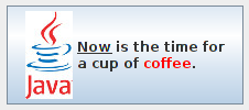
If the string of text that is applied to a button starts with "<html>", then the string is interpreted as HTML. The string does not have to use strict HTML format; for example, you don't need a closing </html> at the end of the string. To get multi-line text, use <br> in the string to represent line breaks. If you would like the lines of text to be center justified, include the entire text (except for the <html>) between <center> and </center>. For example,
JButton button = new JButton(
               "<html><center>This button has<br>two lines of text</center>" );
creates a button that displays two centered lines of text. You can apply italics to part of the string by enclosing that part between <i> and </i>. Similarly, use <b>...</b> for bold text and <u>...</u> for underlined text. For green text, enclose the text between <font color=green> and </font>. You can, of course, use other colors in place of "green." The "Java" button that is shown above was created using:
JButton javaButton = new JButton( "<html><u>Now</u> is the time for<br>" +
                           "a nice cup of <font color=red>coffee</font>." );
and then adding the Java image as an icon for the button.