Section 6.1
Components and Layouts
THE MAIN CLASS IN THE AWT is called Component. The subclasses of Component represent all the visual elements of a graphical user interface (except, inexplicably, menus, which descend from another class, MenuComponent). Component is an abstract class, so that you can only create objects belonging to its subclasses, not to Component itself. The subclasses that represent common GUI elements are: Button, Checkbox, Choice, Label, List, Scrollbar, TextArea, and TextField. Objects of these classes have predefined behaviors. For the most part, all you have to do is add them to your program and they take care of themselves. When the user interacts with one of these components and some action is required, the component generates an event that your program can detect and react to. There is also a Canvas subclass that represents a rectangular area to be used for displaying graphical images.
These predefined components are discussed in Section 2, and the events they generate are covered in Section 3. In this section, I want to concentrate on what it means to "add a component to your program." For this, you need to understand the Container class and its subclasses.
A container in this context is a component that can contain other components. Note that Container is a subclass of Component. The Container class, like Component is an abstract class. Container has two direct subclasses, Window and Panel. A Window represents an independent top-level window that is not contained in any other component. Window is not really meant to be used directly. It has two subclasses: Frame, to represent ordinary windows that can have their own menu bars, and Dialog to represent dialog boxes that are used for limited interactions with the user.
A Panel, on the other hand, is a container that does not exist independently. The Applet class is a subclass of Panel, and as you have seen, an applet does not exist on its own; it is meant to be displayed by a Web browser. Any panel must be contained inside something else, either a Window, another Panel, or -- in the case of an Applet -- a page in a Web browser.
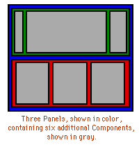 The fact that panels can contain other panels means that you
can have many levels of components
containing other components, as shown in the illustration on
the right. This leads to two questions: How are
components added to a container? How are their
sizes and positions controlled?
The fact that panels can contain other panels means that you
can have many levels of components
containing other components, as shown in the illustration on
the right. This leads to two questions: How are
components added to a container? How are their
sizes and positions controlled?
The sizes and positions of the components in a container are controlled by a layout manager. Different layout managers implement different ways of arranging components. There are several predefined layout manager classes in the AWT: FlowLayout, GridLayout, BorderLayout, CardLayout and GridBagLayout. You can also define new layout managers, if none of these suit your purpose. Every container, by default, has a layout manager. For Panels, including Applets, the default layout manager belongs to the class FlowLayout. For Windows, the default layout manager is a BorderLayout. You can change the layout manager of a container using its setLayout(LayoutManager) method. (It is possible to set the LayoutManager of a container to be null. This allows you to take complete charge of laying out the components in the container. However, I won't deal with this option here.)
As for adding components to a container, that's easy. You just use one of the container's add() methods. There are two add() methods, with signatures add(Component) and add(String,Component). (The second form is used only with BorderLayout and CardLayout, as discussed below.) For example, if you want to create a new Panel and then add three new Buttons to it, you could say:
          Panel panel = new Panel();
          panel.add(new Button("Button 1");
          panel.add(new Button("Button 2");
          panel.add(new Button("Button 3");
This uses the Panel's default FlowLayout layout manager, which would line the buttons up from left to right.
I have often found it to be fairly difficult to get the exact layout that I want in my applets and windows. I will briefly discuss each of the layout manager classes here, but using them well will require practice and experimentation.
BorderLayout
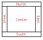 A BorderLayout places one component in the center
of a container. The central component is surrounded by
up to four other components that border it to the "North",
"South", "East", and "West",
as shown in the diagram at the right. Each of the four bordering
components is optional. The layout manager first allocates
space to the bordering components. Any space that is left over
goes to the center component.
A BorderLayout places one component in the center
of a container. The central component is surrounded by
up to four other components that border it to the "North",
"South", "East", and "West",
as shown in the diagram at the right. Each of the four bordering
components is optional. The layout manager first allocates
space to the bordering components. Any space that is left over
goes to the center component.
If a container uses a BorderLayout, then components should be added to the container using the method add(String,Component). The first parameter specifies where the component is to be placed. It must be one of the strings "Center", "North", "South", "East", or "West". (These names are case sensitive. For example, you can't use "east" in place of "East"; if you do, you'll wind up with a mysteriously missing component.) For example, the following code creates a panel with drawArea as its center component and with scroll bars to the right and below:
       Panel panel = new Panel();
       panel.setLayout(new BorderLayout());
               // to use BorderLayout with a Panel, you have
               //     to change the panel's layout manager
       panel.add("Center", drawArea);
               // assume drawArea already exists
       panel.add("South", hScroll);
               // assume hScroll is a horizontal scroll bar
               //     component that already exists
       panel.add("East", vScroll);
               // assume vScroll is a vertical scroll bar
               //     component that already exists
Sometimes, you want to leave space between the components in a container. You can specify horizontal and vertical gaps in the constructor of a BorderLayout object. For example, if you say
panel.setLayout(new BorderLayout(5,7));
then the layout manager will insert horizontal gaps of 5 pixels between components and vertical gaps of 7 pixels between components. (The horizontal gap is inserted between the center and west components and between the center and east components; the vertical gap is inserted between the center and north components and between the center and south components.)
GridLayout
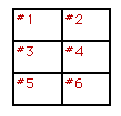 A GridLayout lays out components in a grid of
equal sized rectangles. The illustration shows how the components
would be arranged in a grid layout with 3 rows and 2 columns.
The components are added to the grid in the order shown; that
is, each row is filled from left to right before going on the
next row. When you use a GridLayout, you should
be careful to add just enough components to fill the grid.
Horizontal grids, with a single row, and vertical grids, with
a single column, are very common.
A GridLayout lays out components in a grid of
equal sized rectangles. The illustration shows how the components
would be arranged in a grid layout with 3 rows and 2 columns.
The components are added to the grid in the order shown; that
is, each row is filled from left to right before going on the
next row. When you use a GridLayout, you should
be careful to add just enough components to fill the grid.
Horizontal grids, with a single row, and vertical grids, with
a single column, are very common.
The constructor for a GridLayout with R rows and C columns takes the form GridLayout(R,C). If you want to leave horizontal gaps of H pixels between rows and vertical gaps of V pixels between columns, use GridLayout(R,C,H,V) instead.
FlowLayout
A FlowLayout simply lines up its components without trying to be very neat about it. After laying out as many items as will fit in a row across the container, it will move on to the next row. At least, that's what the documentation says. Often, though, components are added to a container before the size of the container is even known, and in that case, a FlowLayout will just line up the components in one row even if it means that some of them will eventually be outside the container and therefore invisible. Because of this, I have often found FlowLayout to be unacceptable, even though it is the default layout for Panels.
FlowLayouts are useful in at least one circumstance. A Button will ordinarily expand to fill the space available to it. If you "package" it inside a Panel that uses a FlowLayout, however, it will keep its natural, default size. For example, consider:
         Panel mainPanel = new Panel();
         mainPanel.setLayout(new BorderLayout());
         mainPanel.add("Center", myCanvas);
                // assume myCanvas already exists
         Panel bttnPanel = new Panel();
               // use default FlowLayout for bttnPanel
         bttnPanel.add(new Button("Clear");
         mainPanel.add("South", bttnPanel);
This would display a Clear button centered beneath a canvas. On the other hand, if the button were added directly to mainPanel, it would expand to fill the entire width of mainPanel. This also works nicely with several buttons. You can all add the buttons to a panel, and then use that panel as the North or South component is a BorderLayout. The buttons will line up on the top or bottom of the screen, and the Center component will expand to fill the remaining space. (If you want the buttons to be on the East or West, I would suggest using a GridLayout with one column to hold the buttons.)
GridBagLayout
A GridBagLayout is similar to a GridLayout in that the container is broken down into rows and columns of rectangles. However, a GridBagLayout is much more sophisticated because the rows do not all have to be of the same height, the columns do not all have to be of the same width, and a component in the container can spread over several rows and several columns. There is a separate class, GridBagConstraints, that is used to specify the position of a component and the number of rows and columns that it occupies.
Using a GridBagLayout is rather complicated. I will not explain it here; if you are interested, you should consult a Java reference.
CardLayout
CardLayouts differ from other layout managers in that in a container that uses a CardLayout, only one of its components is visible at any given time. Think of the components as a set of "cards". Only one card is visible at a time, but you can flip from one card to another. Methods are provided in the CardLayout class for flipping to the first card, to the last card, and to the next card in the deck. A name can be specified for each card as it is added to the container, and there is a method in the CardLayout class for flipping directly to the card with a specified name. (For some reason, the container object has to be passed to each of these methods as a parameter.)
Suppose, for example, that you want to create a Panel that can show any one of three Panels: panel1, panel2, and panel3. Assume that panel1, panel2, and panel3 have already been created:
         cardPanel = new Panel();
              // assume cardPanel is declared as an instance variable
              // so that it can be used in other methods
         cards = new CardLayout();
              // assume cards is declared as an instance variable
              // so that it can be used in other methods
         cardPanel.setLayout(cards);
         cardPanel.add("First", panel1);
              // add panel1 with name "First"
         cardPanel.add("Second", panel2);
              // add panel2 with name "Second"
         cardPanel.add("Third", panel3);
              // add panel3 with name "Third"
You could then show panel1 by saying
cards.show(cardPanel, "First");
or
cards.first(cardPanel);
Other methods that are available are cards.last(cardPanel) and cards.next(cardPanel). Note that to use a CardLayout effectively, you need to keep both the layout manager and the container that uses the layout manager in instance variables, so that you can refer to them in more than one of your class's methods.
Components in Applets and Frames
When you are writing an Applet or a program that uses a Frame, you should remember that applets and frames are themselves containers. This means that they have add() methods that can be used to add components and a setLayout() method that can be used to replace the default layout manager.
In general, the entire layout of an applet should be set up in its init() method. This will often involve constructing sub-panels and adding them to the applet. If you write a subclass of Frame, then you can set up your frame's layout in your class's constructor. If you make an object of type Frame directly, rather than making a subclass, then you should lay out your frame as soon as you create it and before you make it visible. (A frame is invisible by default; you have to make it visible by calling its show() method.)
One final point: With most layout managers, you can specify horizontal and vertical gaps between components. But what if you want gaps between the edges of an applet or frame and the components that it contains? For that, you have to override the insets() method of the applet or frame. The definition of this method usually has the form:
        public Insets insets() {
           return new Insets(top,left,bottom,right);
        }
where top, left, bottom, and right specify the number of pixels to be inserted as a gap along each edge. Every container has an insets() method, and you can override it whenever you define a subclass of a container class such as Applet or Frame.