THE GIMP is a free image manipulation program that has many of the capabilities of the commercial program, Photoshop. Gimp has several painting tools that can be used for creating original images, but it is most useful for image manipulation such as color correction, touching up pictures, and image composition. In this lab, we will concentrate on Gimp's painting tools, with just a brief look at image manipulation. The first time you start Gimp, it will tell you that it is about to create some files in your account. You should let it do this. You can accept the default values.
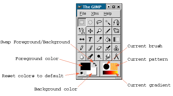
When Gimp starts, you will see its "Toolbox" window and possibly some other windows. The Toolbox is the Gimp's main window. Closing it will end the program. The Toolbox looks like this, although the stuff in the window might be arranged differently, depending on its shape:
The Toolbox is occupied mainly by a set of painting tools; there is a small menu bar at the top; and and at the bottom are the currently selected colors, brush, pattern, and gradient. To create a new image, use the "New" command from the File menu. You will see a dialog box where you can select the size of the new image. Use the "Open" command from the File menu to open an existing image that you want to edit. To apply a painting tool to an image, first click on the tool in the toolbox to select it. To change the current foreground color, background color, brush, pattern, or gradient, click on the corresponding item in the toolbox. You'll see more about how to use these things a minute.
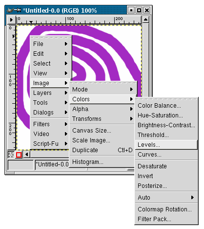
A lot of the functionality of the Gimp is hidden in a pop-up menu that appears when you right-click on an image window. This is a hierarchical menu with many options. Here, for example, the pop-up menu is being used to select the "Levels" dialog box, which you will need later in the lab:
In addition to image windows and the Toolbox, the Gimp has a multitude of dialog boxes. The "Tool Options" dialog is particularly useful. It contains options for the currently selected painting tool. The contents of this dialog box change when you select a new painting tool. Open the Tool Options dialog box with CTRL-SHIFT-T or by selecting "Tool Options" from the Dialogs submenu of the File menu.
Create a new image, so that you can try out the tools. While you are experimenting, remember that you can Undo up to five drawing operations. I will discuss some of the more useful painting tools here, and the options and dialog boxes that are associated with them.
First, a word about selections. The first seven tools in the Toolbox are selections tools that can be used to select regions in an image. Selections are very important in the Gimp, and we will look at them in detail in a later lab. For now, you should know that when a region is selected in an image, you can only paint inside that region. Any attempt to modify the image outside the selection is ignored. An easy way to turn off all selections is with CTRL-SHIFT-A.
The three tools that are used for "painting" in the most obvious sense are the pencil, the brush, and the pen tools. Of these, the brush is by far the most useful, and that is the only one I will discuss. (The pencil is almost the same as the brush, but it draws sharper lines. The pen draws lines that are supposed to look like ink.)
Select the brush tool. Click-and-drag on an image window to draw with the brush tool. Alternatively, hold down the Shift key and click on a sequence of points. The brush will draw straight lines between the points that you click. The shape of the brush is determined by the "Brush Selection" dialog. Open this dialog by clicking on the Current Brush icon in the Toolbox or with CTRL-SHIFT-B. The line drawn by the brush is just a series of copies of the basic brush shape. Try changing the "Spacing" in the Brush Selection dialog to see the effect on the line that is produced. For most of the brushes, the color that is used for drawing is the current foreground color. To change this color, click on the Current Foreground Color icon in the Toolbox window. Some brushes, such as the green pepper brush, have their own colors that are used instead of the Foreground Color.
Take a look at the Tool Options dialog box for the brush tool. (Remember that the brush must be selected for you to see its options.) "Opacity" is a common option for many tools. At the default setting, 100, the brush is fully opaque. If you reduce the opacity, the brush becomes partially transparent. Try this: Draw in one color at 100 opacity. Switch to a different color, reduce the opacity to 50, and draw over your previous drawing. The Pressure Sensitivity option is, unfortunately, irrelevant to us since it is only for use on a computer that has a pressure-sensitive drawing tablet instead of a mouse. The Fade Out option is interesting: It makes the brush act as if it is running out of paint as you move it. Turn on this option and try it. Note that you can set the number of pixels (px) that it takes for the paint to run out. The Gradient option lets you draw using the currently selected gradient. Try it. The brush changes color as you move it, according to the current gradient. To select a different gradient, click the "Current Gradient" icon in the Toolbox window.
The bucket tool is used to fill a region with a color or pattern. In the Tool Options for the bucket, you can select whether it will fill with the foreground (FG) color, with the background (BG) color, or with the currently selected Pattern. A pattern is just a small image that will be repeated as necessary to fill the region. To select the pattern, click on the Current Pattern icon in the Toolbox Window, and then click the pattern that you want in the Pattern Selection dialog. (Click-and-hold on a pattern to see the whole pattern at full size.) The bucket has the usual Opacity option that can be used to select for transparency. The Threshold option determines which pixels will be affected when you use the tool. In the default setting of 15, the paint will only spread to cover pixels that were similar in color to the pixel where you click. If you increase the threshold to 255, then the paint will fill the entire image. If you decrease the threshold to 0, it will only spread to pixels that are exactly the same color as the place where you click.
Remember that, as with all paint tools, if there is a selection, then the bucket only affects pixels in the selection. For example, you could use the rectangular selection tool to select a rectangular region and use the bucket to fill just that rectangle. Try this with the Opacity option turned down and with the Threshold set to 255. Try this with a pattern!
The gradient tool (which is officially called the "Blend Tool") is used to fill the entire image (or just the selected region) with a gradient. A gradient is just a changing sequence of colors. The "color" in this case can also include the special value "transparent", which lets the background show through. To see its default operation, select the gradient tool, and then click-and-drag on an image. When you release the mouse, a gradient is created in which the color changed from the foreground color at the point where you clicked the mouse to the background color at the point where you release the mouse. Try dragging the mouse both short distances and longer distances.
 Now take a look at the Tool Options for the gradient tool.
As usual, there is an Opacity option. The Blend option can be used to
change from the usual foreground (FG) to background (BG) gradient
to a "FG to Transparent" or to a "Custom Gradient". If you select
"Custom Gradient", then the gradient that is used is the Current
Gradient that is selected in the Toolbox window. To see the effects
of the "Gradient" and "Repeat" options, just try them! Be sure
to try the "Radial" and "Square" Gradient options. Turn on the
"Adaptive Supersampling" option to get smother blending of colors
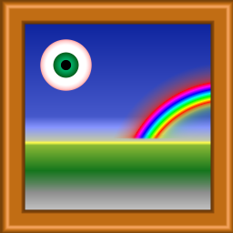
in the gradient. The image at the right was created using nothing
but gradients (plus a rectangular selection to limit the extent of
the rainbow). For example, the "eyeball" was made with the
"Radial_Eyeball_Green" custom gradient and a "Radial" gradient option.
Now take a look at the Tool Options for the gradient tool.
As usual, there is an Opacity option. The Blend option can be used to
change from the usual foreground (FG) to background (BG) gradient
to a "FG to Transparent" or to a "Custom Gradient". If you select
"Custom Gradient", then the gradient that is used is the Current
Gradient that is selected in the Toolbox window. To see the effects
of the "Gradient" and "Repeat" options, just try them! Be sure
to try the "Radial" and "Square" Gradient options. Turn on the
"Adaptive Supersampling" option to get smother blending of colors
in the gradient. The image at the right was created using nothing
but gradients (plus a rectangular selection to limit the extent of
the rainbow). For example, the "eyeball" was made with the
"Radial_Eyeball_Green" custom gradient and a "Radial" gradient option.
Finally, for today, I will mention the clone, which looks like a little rubber stamp in the Toolbox window. This tool allows you to copy or "clone" a pattern or image. You draw with the clone tool in the same way that you draw with a brush, and the clone tool uses the same Current Brush as the brush tool. However, instead of drawing with the foreground color, it draws with part of the Current Pattern, or with part of an image. To draw with the Current Pattern, select "Pattern Source" in the Tool Options window for the clone tool. To draw with an image, there is one additional step, since you have to specify where you want to copy the image from. Select "Image Source" in the Tool Options window. Then control-click (that is, hold down the Control key while you click) at a point in the image that you want to copy. This can be in any image window. You can use the clone tool to copy one part of an image to a different location in the same image, or you can copy from one image to a different image. Use control-click to specify where you want to copy from, and then start drawing as usual at the point where you want to copy to. The "Alignment" option in the Tool Options window determines the relationship between points in the original image and points in the copy. If this option is set to "Non Aligned", then each point you click in the copy corresponds to the point where you control-clicked in the original, and a new copy grows out from that point as you drag the mouse. Each click-and-drag operation is essentially a new copy of the source. If it is set to "Aligned", then only the first point that you click in the copy matters. Subsequent click-and-drag operations just extend a single copy of the original. In the "Registered" setting, the top-left corner of the original corresponds to the top-left corner of the copy.
The GIMP has many tools for manipulating existing images. Here is one small example. Here is an aerial view of HWS. This is a faded-out version of the original.
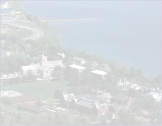
This faded version might be used as a background on a Web page. Most photos are unsuitable as backgrounds for text, since the text will be hard to read no matter what color it is. But by fading or darkening the image, you can often get an appropriate background image.
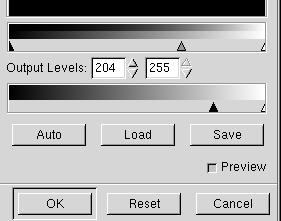 The faded image was made using Gimp "Levels" dialog. To do this,
I opened the original picture. I then opened the Levels dialog by
right-clicking on the image and selecting "Image" then "Colors" then
"Levels" from the pop-up menu (as shown in the illustration earlier on this
page). In this dialog, I adjusted the color levels by dragging the
little triangular arrows, below the two "gradients", as shown at the
right. The lower set of arrows controls the colors in the modified
image. The middle arrow in the upper set can be adjusted to improve
the balance of colors. You can try it yourself: Click on
this link to view the original image
and use your Web browser's "Save" command to save a copy.
Open the image with the GIMP, and adjust the colors with the Levels dialog.
To save the result, right-click the image and select the "Save"
command from the file menu. This will replace the original file.
(Use "Save As" if you want to make a new file.)
The faded image was made using Gimp "Levels" dialog. To do this,
I opened the original picture. I then opened the Levels dialog by
right-clicking on the image and selecting "Image" then "Colors" then
"Levels" from the pop-up menu (as shown in the illustration earlier on this
page). In this dialog, I adjusted the color levels by dragging the
little triangular arrows, below the two "gradients", as shown at the
right. The lower set of arrows controls the colors in the modified
image. The middle arrow in the upper set can be adjusted to improve
the balance of colors. You can try it yourself: Click on
this link to view the original image
and use your Web browser's "Save" command to save a copy.
Open the image with the GIMP, and adjust the colors with the Levels dialog.
To save the result, right-click the image and select the "Save"
command from the file menu. This will replace the original file.
(Use "Save As" if you want to make a new file.)
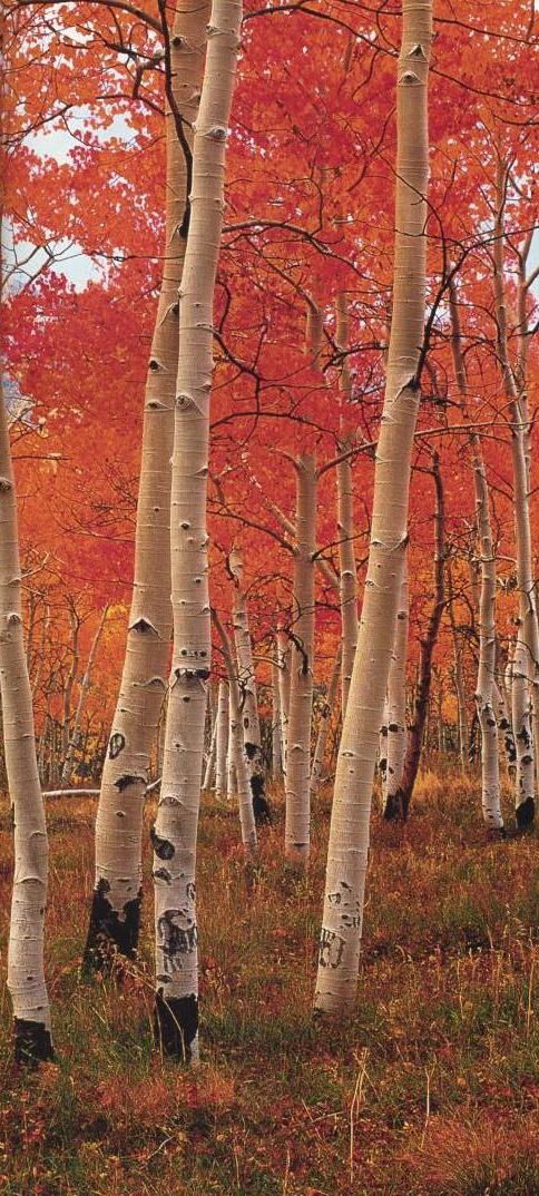
(By the way, I did something similar for the trees on the left edge of this window. I started with a brightly colored original image, and I then used the gradient tool to fade the image so that the amount of fading decreases gradually from right to left. In the Tool Options dialog for the gradient tool, I set the gradient to be "FG to Transparent", and I used the usual Linear Gradient style and white foreground color. To apply the gradient, I dragged from right to left across the image. The right edge became completely white, while the left edge was unaffected because of the transparency. I cut a narrow vertical strip out of the image to use as the background on this page.)
Obviously, Gimp has more tools than I've discussed here. You can read more about Gimp's painting tools in the Gimp User's Manual. You can find a pdf version of this in the directory /home/cs324. The file name is gimp-manual.pdf. You can read this file with Acrobat Reader. (Use the "acroread" command on the command line. In the KDE file manager, right-click the file and select "Acrobat Reader" under "Open with".)
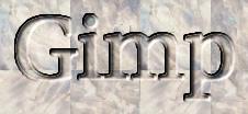 Finally, to show off some of the Gimp's more advanced image creation
tools, we'll use it to create text logos, like the one shown at the
right. However, we will cheat, by using "scripts" instead of
doing it directly. Gimp is highly scriptable, and it comes with
a number of scripts written in an oddly named language, "Script-Fu".
To find the scripts for making text logos, go to the "Xtns" menu in
the Gimp Toolbox window, then to the "Script-Fu" sub-menu, and then
to the "Logos" submenu of that. (Hint: Click on the dotted
line at the top of the menu to "tear off" the menu and make it a separate
window. This will make it stay open so that you can use it easily.)
Finally, to show off some of the Gimp's more advanced image creation
tools, we'll use it to create text logos, like the one shown at the
right. However, we will cheat, by using "scripts" instead of
doing it directly. Gimp is highly scriptable, and it comes with
a number of scripts written in an oddly named language, "Script-Fu".
To find the scripts for making text logos, go to the "Xtns" menu in
the Gimp Toolbox window, then to the "Script-Fu" sub-menu, and then
to the "Logos" submenu of that. (Hint: Click on the dotted
line at the top of the menu to "tear off" the menu and make it a separate
window. This will make it stay open so that you can use it easily.)
Click on one of the commands in the Logos menu. An option box will open that will let you customize the logo. You can change the text that it will display and choose a font and font size. There will probably be some other options as well. You can try the defaults and then play around with some changes. The logo will be created when you click OK. The logo show above was made with the "Carved" command. Try 3D Outline, Alien Glow, Glossy, and SOTA Chrome, for example.
When you find a logo that you want to save, you might have to do the following before you can save it: Right click on the logo image, Select "Layers" from the pop-up menu, and then select "Flatten Image" from the sub-menu. (This is a technicality that you will learn more about in a later lab.) To save the image, right-click on it and use the "Save" command from the "File" menu. You probably want to save the image as a JPEG image. Just use ".jpg" as the extension at the end of the file name that you enter for the image. If this doesn't look good, you can try a ".png" image. If you are going to use the image on a Web page, remember to check the file size. You don't want to use a huge file for a logo, since the download time will annoy people who visit your Web page.
Your assignment for this lab is to make several images using the Gimp, as specified below, and to exhibit them on a Web page. Each image must be accompanied by a short paragraph that explains how you used the Gimp to produce the image. This page will be part of you Web portfolio for the course. See the course handout for more information about the requirements for your Web portfolio. Note that your web portfolio must be at a specific Web address, with a main index page and separate pages for each lab. This assignment must be completed and available on the Web before next Wednesday's lab.
The required images include:
You are welcome to add extra images, if you like! Grading will be partly based on aesthetics and ambition.