CPSC 324, Fall 2002
Lab 5: Last Look at GIMP
THIS LAB gives you one last look at the Gimp, before we move permanently on to three-dimensional graphics. The major part of the lab is a final exercise in image composition, but before that there is a shorter exercise that introduces the Curves dialog and the eye-dropper tool.
Color Correction with the Curves Dialog
 You have already looked at the Levels dialog, which allows you
to adjust the colors and brightness levels of an image. Gimp has
a similar but more sophisticated tool for color correction:
the Curves dialog box. You can find it by right-clicking an image
and selecting Image/Colors/Curves. You might want to tear off
the Colors sub-menu so that you will have easier access to the Curves
dialog.
You have already looked at the Levels dialog, which allows you
to adjust the colors and brightness levels of an image. Gimp has
a similar but more sophisticated tool for color correction:
the Curves dialog box. You can find it by right-clicking an image
and selecting Image/Colors/Curves. You might want to tear off
the Colors sub-menu so that you will have easier access to the Curves
dialog.
Both Levels and Curves allow you to set up a mapping of current color values to new color values. If you make an adjustment to the Red component of the color, for example, then the red component of each pixel will be replaced by a new value based on the mapping that you have defined. The Levels dialog can set up only fairly simple mapping. The Curves dialog can define arbitrary mappings. This is important because, for example, pixels with a lot of red might need one type of adjustment, while pixels with only a little red might need another type of adjustment, and pixels with a medium amount might need no adjustment at all. (And, by the way, if there is a selection, then Levels and Curves apply only to the selected region. This allows even finer control if you need it.)
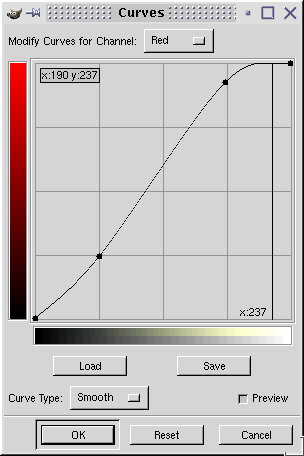
The Curves dialog allows you to define mappings for the Red, Green, Blue, and Value components of a color (where Value affects the overall brightness). A mapping is defined by a curve like the one shown at the right. Current color values are along the horizontal axis, and new color values are along the vertical axis. The curve defines what new value will replace each current value. You can drag the points on the curve, including the endpoints. The coordinates of the point that you are dragging are shown in the upper left corner of the graph area. In the picture, we see that the point (190,237) is on the graph. This means that pixels that currently have a red value of 190 will be modified so that their red value becomes 237. If you have some numerical values for the changes that you want to make, you can set the curve to reflect those values exactly. You can add new points to the curve simply by clicking on it. You get a preview of the change as you modify the curve. The change doesn't actually take effect until you click OK. For example, if you save the image before clicking OK, it's the old, unmodified image that will be saved. If you close the Curves dialog without clicking OK, then the changes will be lost.
![]() Often, it is easy to tell that the colors in an image are "off,"
but it's not easy to tell exactly what should be done to correct them.
The eye-dropper (or color-picker) tool can sometimes
be a help. This tool is used to sample colors in an image. When you
click on an image with this tool, the color of the pixel that you
clicked is selected as the current drawing color. More important for
our purposes here, a small dialog box pops up that displays the
red, green, and blue components of the color. In some cases, these
component values can help you determine how to set the curves
in the Curves dialog.
Often, it is easy to tell that the colors in an image are "off,"
but it's not easy to tell exactly what should be done to correct them.
The eye-dropper (or color-picker) tool can sometimes
be a help. This tool is used to sample colors in an image. When you
click on an image with this tool, the color of the pixel that you
clicked is selected as the current drawing color. More important for
our purposes here, a small dialog box pops up that displays the
red, green, and blue components of the color. In some cases, these
component values can help you determine how to set the curves
in the Curves dialog.
In Grokking the GIMP, Chapter 6, Corey Bunks gives some hints. If you think that a certain part of the image should be gray, for example, you can use the eyedropper tool to determine the actual RGB colors. If the R, G, and B are different, you can use the Levels dialog to adjust one or two of the color curves. For example, if a pixel that should be gray has RGB values (100,130,100), you can try adjusting the green curve so that it goes through the point (130,100). That is, wherever the current green value is 130, it should be changed to 100. This will correct the offending pixel -- and hopefully will have a good effect on the rest of the image.
You can use other known colors in the image in the same way. For example, according to Bunks, for a "medium Caucasian flesh tone" the red level should be about 20% higher than the green level, and the blue level should be about 10% lower than the green level. The image shown below is a picture of a class trip in Australia (so we can assume that the skin tones should be about as medium Caucasian as you can get). This picture is taken from a collection of photos by Professor Kevin Mitchell. I chose it because the colors are rather bad. My corrected version is also shown.
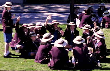
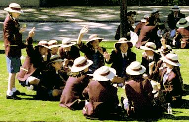
When I worked on this image, I used the eyedropper tool to sample points. in the road, which I thought should probably be closer to gray. I found RGB values of (148,140,165) and (49,41,123) in the road. The first sample led me to change the Blue curve to contain the point (165,145), which will change the first pixel to be almost gray. The RGB of (49,41,123) indicates that I might want the point (123,45) on the Blue curve, but the change seemed too extreme so I used something closer to (120,75). Finally, sampling the skin tones led me to boost the green mid-tones a bit. Then, after finishing with the curves tool, I decided to use the Levels tool to adjust the Value a bit in an attempt to bring some of the image out of shadow.
Exercise 1. The image kookaburra.gif contains an image of a bird in a tree. The colors and lighting are very bad. The bright feathers on the bird should be gray or white, not blue. The tree limb also has an unnatural bluish tinge. Fix the colors and brightness of this image. Since this is an indexed color image, you will have to convert it to an RGB image (using the Image/Mode/RGB menu command) before you can adjust the color. Use the Curves dialog to adjust the colors. Obviously, you have to adjust the blue, but how? Use the eye-dropper tool to sample the color at various points and use the information to help you change the blue curve, as described above. To get a good image, you'll need to add a couple of points to the curve. After adjusting the color, you can adjust the general brightness levels using the Levels dialog. Add the original image and the improved image to your Web site, along with a short commentary that describes the work you did.
An Image Composition Project
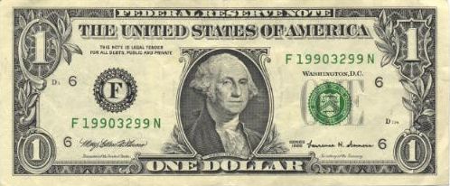
In the previous lab, you added an animal to a forest. Here is my attempt at a more realistic image composition project. The goal of the project is to make an image that looks like a dollar bill or ten dollar bill, but with another person replacing the usual figure from American history. Here is the image I made the last time I taught the course, showing Sean (a former student) in place of George Washington on a dollar bill:
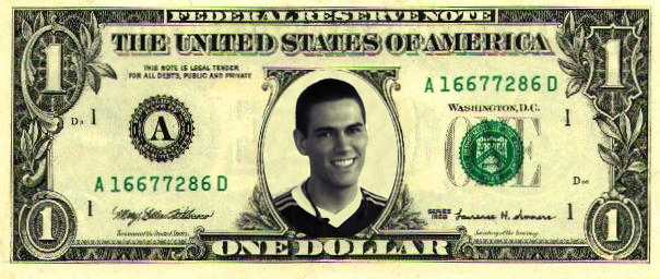
The original image of a dollar bill was made using a scanner. Sean's head was taken from a color photograph. I used a variety of tools in this project. Here is an outline of the process that I used:
- I used the Image/Colors/Desaturate command to get an RGB image in which the R, G, and B components are all equal. This looks like a grayscale image, but it's still an RGB image, so I can adjust the colors.
- Since the image was too dark, I used the Levels tool (Image/Colors/Levels) to brighten the darker parts of the image.
- I then had to adjust the color of the image to make it match the colors of the dollar bill. I first used the Eye-dropper to test the colors in the dollar bill. My observation: The lighter colors tend to have similar amounts of red and green, with a lesser amount of blue (for example: 247,242,184 or 195,193,145). The darker pixels tend to have more similar amounts of red, blue, and green.
- I used the Curves dialog (Image/Colors/Curves) to adjust the colors in the picture of Sean. I adjusted the Red and Green curves based on my observations of the dollar's colors.
 Sean was the wrong size, so I had to scale his picture to fit.
To find the scaling factor, I used the measure tool. If you
click-and-drag on an image with this tool, the length of the line
that you make is shown below the image. I measured Sean and
George Washington and used a calculator to compute the quotient
of the two sizes. I used this quotient as the Ratio in the
Image/Scale-Image command.
Sean was the wrong size, so I had to scale his picture to fit.
To find the scaling factor, I used the measure tool. If you
click-and-drag on an image with this tool, the length of the line
that you make is shown below the image. I measured Sean and
George Washington and used a calculator to compute the quotient
of the two sizes. I used this quotient as the Ratio in the
Image/Scale-Image command.
- I pasted the image of Sean into a new layer on the dollar bill image. I did Edit/Select-All on the photo of Sean, then Edit/Copy. I then did Edit/Paste on the dollar bill, opened the Layers, Channels, and Paths dialog, and clicked the "New Layer Button" to make the pasted selection into a new layer.
 After dragging Sean into position,
I cut away the part of Sean's picture that I didn't want. First,
I cut back the opacity of the layer so that I could see what I was doing.
I then made an elliptical selection, then inverting it,
and using Edit/Cut. I also cut a little off the bottom
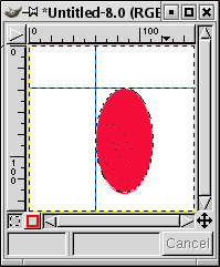
of the ellipse. (Note on making elliptical selections: You can use
guides to help you make elliptical selections. The image shown
here uses two guides to mark the top and left side of the red ellipse.
To create a guide, just click in the ruler at the top or left edge
of the window, and drag onto the image. If two guides are set up as
shown, it's easy to make the selection. Just start dragging with the
elliptical selection tool at the point where the guides intersect.
You can move the guides or drag them off the image with the Move tool.)
After dragging Sean into position,
I cut away the part of Sean's picture that I didn't want. First,
I cut back the opacity of the layer so that I could see what I was doing.
I then made an elliptical selection, then inverting it,
and using Edit/Cut. I also cut a little off the bottom
of the ellipse. (Note on making elliptical selections: You can use
guides to help you make elliptical selections. The image shown
here uses two guides to mark the top and left side of the red ellipse.
To create a guide, just click in the ruler at the top or left edge
of the window, and drag onto the image. If two guides are set up as
shown, it's easy to make the selection. Just start dragging with the
elliptical selection tool at the point where the guides intersect.
You can move the guides or drag them off the image with the Move tool.)
- The background around Sean's head didn't look good, so I wanted to color it to match the background of the bill. First, I selected the background area around Sean's head, using the magic wand and lasso tools (and using the shift and control keys to add to or subtract from an existing selection). With the selection in place, it is only possible to paint inside the selection. I then used the clone tool to copy part of the general background area of the dollar bill to the area around Sean's head. (When using the clone tool, remember that you first have to Control-click on the area you want to copy.)
- Finally, I fixed Sean's collar, which looked too bright. I did this by selecting the collar and filling it with a solid color using the bucket tool. I selected an appropriate fill color using the eye-dropper tool.
And that's it. The result is not bad.
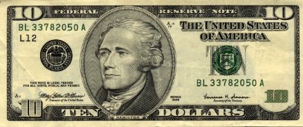
Exercise 2. Replace George Washington on dollar_bill.jpg or Alexander Hamilton on ten_dollar_bill.jpg with someone's head taken from another image. You can use hiroki.jpg (another former student) if you want, or you can find another image to use. Your object is to produce a natural-looking result, in which the colors look right and the pasted image blends well with its background. Post the final result on your Web site. (Commentary on your work is optional for this exercise.)
One Last Exercise
Exercise 3. Do something with the Gimp! Choose a little project of your own and post the result on your Web site, along with an explanation of how you made it. Part of the grade for this exercise will be based on ambition and execution. Projects that involve some image composition are more likely to get a high grade. (Note that I don't expect an unreasonable amount of work -- this is still just 1/3 of a lab.)