In the lab today, you will work with exclusively with the GIMP. One aspect of the lab deals with color and the tools available in the GIMP for adjusting image color. The second part of the lab continues the study of selections and their equivalent, masks.
You should complete this lab and add your work to your Web portfolio before the next lab on March 20. I expect to see more than pictures on the Web: You will, of course, want to add some prose explaining what you have done.
With a test coming up on Thursday, I will be happy to take part of the lab time to answer any questions you have about the test or about any of the topics on the information sheet for the lab.
To begin the lab, sign onto your account on the math/cs network using X-Win32, and copy the folder /home/cs324/lab3 into your home directory, or a subdirectory of your home directory. You can copy the folder with the command:
cp -r /home/cs324/lab3 .
Color of Money
As a first project, let's go back to the problem of putting our student, Sean, into the dollar bill. If you tried to do this in a way that would make the colors fit together nicely, you probably found it difficult. After working on this some more, I got the following image:
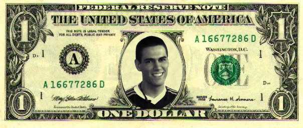
The colors look pretty good. You should do something similar, using the files sean.jpg and dollar.jpg. Here are the steps that I used:
First, I wanted to get a better idea of the colors in the dollar bill. For this, I used the eye dropper tool. When you click on a pixel with this tool, it will set the drawing color to the color of that pixel. More important here, it will pop up a window that tells you the RGB components of the color. Write down the RGB colors for some typical points in the dollar bill. Look at both lighter shades and darker shades. My observation: The lighter colors tend to have similar amounts of red and green, with a lesser amount of blue (for example: 247,242,184 or 195,193,145). The darker pixels tend to have more similar amounts of red, blue, and green.
 Second, change the colors in the image sean.jpg. To do
this, first remove the colors with the Image:Colors:Desaturate
command. (This gives an RGB image in which the red, green, and blue
components of each pixel are the same. This is different from a
grayscale image, which uses indexed colors with 256 shades of gray
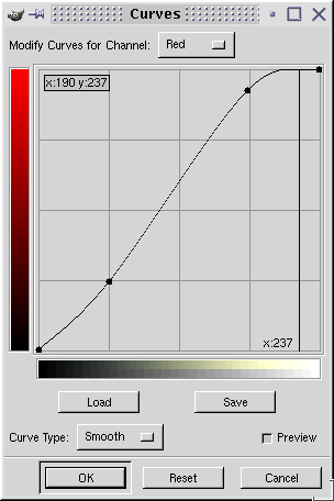
in the color table.) Then use Image:Colors:Curves to open the
Curves dialog, shown at right. Adjust the red and green color curves
to try to match the colors of the dollar bill. (Alternatively, you can
adjust the blue curve, but I felt this made the image too dark.)
In the dialog at the right, I have adjusted the red curve by clicking
near the points (185,240) and (65,65). This makes two new control points
on the curve, which can then be dragged around to adjust them further.
The point of this was to add some red to the brighter tones, while leaving
the darker tones about the same. I used the point (185,240), since it means
that when the blue value, which I won't change, is 185, the red value will
be 240. This is in accordance with the values I read using the eye dropper
tool. After doing the red curve, switch to the green curve and adjust
it to pretty much match the red. The resulting colors match the dollar
bill pretty well, and this was much easier than trying to match them
by aimlessly fooling around with the colors. After doing the adjustments,
make sure that you click OK to apply them permanently to the picture.
Second, change the colors in the image sean.jpg. To do
this, first remove the colors with the Image:Colors:Desaturate
command. (This gives an RGB image in which the red, green, and blue
components of each pixel are the same. This is different from a
grayscale image, which uses indexed colors with 256 shades of gray
in the color table.) Then use Image:Colors:Curves to open the
Curves dialog, shown at right. Adjust the red and green color curves
to try to match the colors of the dollar bill. (Alternatively, you can
adjust the blue curve, but I felt this made the image too dark.)
In the dialog at the right, I have adjusted the red curve by clicking
near the points (185,240) and (65,65). This makes two new control points
on the curve, which can then be dragged around to adjust them further.
The point of this was to add some red to the brighter tones, while leaving
the darker tones about the same. I used the point (185,240), since it means
that when the blue value, which I won't change, is 185, the red value will
be 240. This is in accordance with the values I read using the eye dropper
tool. After doing the red curve, switch to the green curve and adjust
it to pretty much match the red. The resulting colors match the dollar
bill pretty well, and this was much easier than trying to match them
by aimlessly fooling around with the colors. After doing the adjustments,
make sure that you click OK to apply them permanently to the picture.
Third, put Sean on the dollar bill. You've done this before. Resize the image of Sean. (An X Ratio of 0.45 will work.) Select all and copy, go to the image of the dollar, and paste. Open the Layers and Channels dialog with CTRL-L, and click the New Layer button to make the pasted image into a new layer. Make the layer partially transparent, and use the elliptical selection tool to select the portion of the image that you want to keep. Feather the selection if you like. Then invert the selection with CTRL-I and do a CTRL-X to get rid of the extra stuff.
Fourth, fix up the background around Sean's head. I didn't quite like the way it looked. Fixing it gives you the opportunity to learn about a few new tools. The first step is to select the background. You can use the magic wand tool, but there are a few problems. When you click the background, it doesn't select the whole thing. You can fix this by shift-clicking a few different spots in the background. When you hold down the shift key as you click with a selection tool, you add the new selection to the current selection. When you've selected the whole background this way, you will find that some extra stuff has been selected. To get rid of this, you want to subtract from the current selection. To to this, use the lasso tool and control-click as you start to draw: When you control-click with a selection tool, the new selection that you make is subtracted from the current selection. With the lasso tool, you just draw a loop around the stuff that you want to select (or, in this case, to unselect). Once you have the background area selected, you can modify it without affecting the rest of the image. Remember that any painting that you do when there is a selection affects only the selected area. I tried using the bucket tool to fill the background with an appropriate color, but it didn't look good compared to the mottled color of the rest of the bill. What I wanted was to make the background area around Sean's head look like the background of the rest of the bill. For this, the clone tool is appropriate. (It looks like a little rubber stamp.) The clone tool copies part of an image from one place to another. To use it, you first control-click on the region that you want to copy. This is a little tricky in this case, since I want to copy from one layer to another. In the Layers and Channels dialog, activate the background layer. Control-click somewhere in the yellowish background area of the bill. Go back to the Layers dialog and reactivate the upper layer. Now paint with short strokes in the area around Sean's head to fill it with a copy of the area of the dollar bill that you selected. (If your strokes are too long, you will get parts of the bill that you don't want, but you can paint over them.) The clone tool paints with the currently selected brush, so should make sure that a reasonable brush is selected in the brushes dialog. When you are done, turn off the selection with Select:None (CTRL-SHIFT-A). The clone tool is useful for removing small defects in photos or for deleting small, unwanted features.
Finally, fix Sean's collar, which looks too bright. I did this by selecting the collar and filling it with a solid color using the bucket tool. I selected an appropriate fill color using the eyedropper tool.
Exercise 1: Add the completed composition to your Web portfolio.
The Color of their Skin
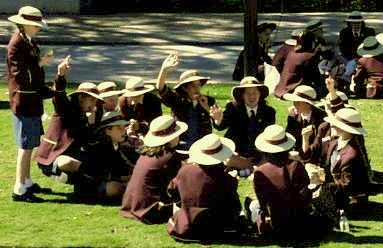
It often happens that the colors in a photograph are "off." The GIMP can help to correct this, but it's not always easy to determine what correction is needed. In Grokking the GIMP, Chapter 6, Corey Bunks gives some hints. If you think that a certain part of the image should be gray, for example, you can use the eyedropper tool to determine the actual RGB colors. If the R, G, and B are different, you can use the Levels dialog to adjust one or two of the color curves. You can use other known colors in the image in the same way. For example, according to Bunks, for a "medium Caucasian fleshtone" the red level should be about 20% higher than the green level, and the blue level should be about 10% lower than the green level.
The image AustraliaClassTrip.gif is a picture of a class trip in Australia (so we can assume that the skin tones should be about as medium Caucasian as you can get). This picture is taken from a collection of photos by Professor Kevin Mitchell. I chose it because the colors are particularly bad. See what you can do with it. For comparison, you can look at my corrected version.
When you first open AustraliaClassTrip.gif in GIMP, you will find that most of GIMP's commands are unavailable. This is because gif uses an indexed color model, and most of GIMP's features only apply to RGB images. Use the Image:Mode:RGB command to convert the image to RGB format.
When I worked on this image, I used the eyedropper tool to explore the colors and then used the Curves dialog to adjust them. (I also did a final adjustment with the Levels dialog to bring some detail out of the shadows. You can look into this if you like.)
Exercise 2: Add before-and-after images of the AustraliaClassTrip to your Web portfolio.
Exercise 3: Find another image that can use some color adjustment, and fix it up. Add before-and-after images to your web portfolio.
Selections and Masks
You have seen how important selections can be for image editing. A "selection" means that certain pixels are selected, but something more interesting can happen in the GIMP: pixels can be partially selected. You saw this in the previous lab when you "feathered" a selection. The pixels near the selection border became partially selected. Because pixles can be partially selected, it is sometimes useful to think of a selection as a "mask". A mask is simply a grayscale image where the the gray level of each pixel indicates the degree to which that pixel is selected. A white pixel is fully selected. A black pixel is fully unselected. A gray pixel is partially selected. Masks and images in GIMP are different, but equivalent, ways of looking at the same thing. In this section of the lab, we'll look at some new aspects of working with selections and masks.
To start, let's look at the Bezier selection tool, one of the more sophisticated tools for making selections. To get a feel for this tool, start with a new, blank image. Click the Bezier Selection tool in the GIMP toolbox. To use this tool to select a region, click on some points along the border of the region you want to select, and finish by clicking again on the point where you started. This gives you a closed Bezier curve, which now just looks like a polygon. The region does not have to be convex. You can turn the curve into a selection by clicking inside it, but don't do this yet. The whole point is that you can edit the curve before turning it into a selection.
Each of the points that define the curve has a hidden pair of "handles". If you click on a point and drag, the handles become visible. The positions of the handles determine the shape of the curve between two points. The curve is tangent to the handle. The length of the handle also affects the curve. Try creating handles and dragging them around for a few of the points on your curve. Note that if you move one of the two handles for a point, the other one moves in synchrony. You can also move one handle separately by shift-clicking it and dragging. Try it.
The Bezier selection tool can be used to select complicated regions. Click around the border of the region, then adjust the handles to make the fit more exact. In general, you don't need a lot of points. You need a point at any "corner," since the curve will always be smooth between the points. However, you don't need a lot of points along a curved portion of the boundary, since you can adjust the handles to make the curve fit the boundary. Let's try it with an image.
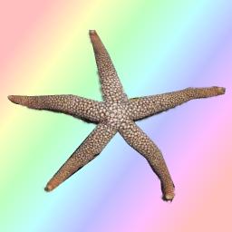 Open the file starfish.jpg. It shows a starfish on a coral. The
object of the exercise is to select the starfish, so that you can
copy-and-paste it into another image. The picture at the right shows
my attempt at this (which is OK, but not great). Start with
the Bezier selection tool. Click at some points along the edge
of the starfish, then adjust the handles to make the fit better.
It can be useful to zoom in on the image for a better view.
Use the View:Zoom-In command.
Open the file starfish.jpg. It shows a starfish on a coral. The
object of the exercise is to select the starfish, so that you can
copy-and-paste it into another image. The picture at the right shows
my attempt at this (which is OK, but not great). Start with
the Bezier selection tool. Click at some points along the edge
of the starfish, then adjust the handles to make the fit better.
It can be useful to zoom in on the image for a better view.
Use the View:Zoom-In command.
Even with the Bezier tool, you will probably not get a perfect selection. GIMP has a neat feature that allows you to modify a selection by working with the corresponding mask. Since a mask is an image, you can modify it using any of the usual painting tools. Here, I will explain just the easiest way of modifying the mask.
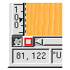 After you have your Bezier selection as refined as you care to make it, click
on the "quick mask" button, the little button outlined in red in the
bottom left corner of the image window. This transforms the selection into
a mask. You see the mask as a partially transparent red film, which fills
the pixels that are not selected. To set the degree of transparency,
double-click the quick mask button. You get a dialog box where you can
set the mask opacity. There is also a colored rectangle in the dialog box.
Click this to set the color of the mask. You can transform the mask
back to a selection by clicking the small button next to the quick mask button.
After you have your Bezier selection as refined as you care to make it, click
on the "quick mask" button, the little button outlined in red in the
bottom left corner of the image window. This transforms the selection into
a mask. You see the mask as a partially transparent red film, which fills
the pixels that are not selected. To set the degree of transparency,
double-click the quick mask button. You get a dialog box where you can
set the mask opacity. There is also a colored rectangle in the dialog box.
Click this to set the color of the mask. You can transform the mask
back to a selection by clicking the small button next to the quick mask button.
While the mask is in effect, any painting that you do with any of the regular paint tools will modify the mask rather than the image. Keep in mind that the mask shows pixels that are not in the selection. If you use the eraser tool to erase part of the mask, you are actually adding pixels to the selection. If you paint with a brush and add pixels to the mask, you are actually removing those pixels from the selection.
To adjust the edges of the starfish selection, choose a rather small brush in the brush selection dialog. Then use the eraser tool and/or paintbrush tool to modify the mask. When you are happy with the selection, convert the mask back into a selection. Use CTRL-C to copy the starfish, ready to paste into another image. (You might want to feather the selection a bit first, to make the paste a bit more seamless.)
Exercise 4: Make an image containing your copy-and-pasted starfish and several other items that you have copied from other images. (For example, you could use some of the animal images from http://www.zoonet.org/gallery.htm.) Try to do a nice job on the selections! Your exhibit on the Web should include the original images.
David Eck, February 2001