CS 424, Fall 2015:
Gimp 2: Selections, Paths, and Layers
This lab continues the introduction to Gimp that we started last week. It will introduce you, briefly, to some of Gimp's more advanced features. The lab adds three new exercises, which should be submitted into the same folder as the five previous exercises. Remember that I will look for your work one week after today's lab.
A general note... Sometimes it is helpful to work on a magnified image. At high magnification, it is even possible to edit individual pixels in the original image. The "View" / "Zoom" menu can be used to control the magnification level. Note that the 1, 2, 3, 4, and 5 keys can be used to quickly change the magnification (just hit the keys, with no Control or other modifier key).
More About Selections
You already encountered selections last week, but there's a lot more to learn. One of the most important is that a pixel can be partially selected. That is, a selection is not necessarily just an outline; it's really an assignment of a "degree of selectedness" to each pixel. For example, the Cut command (Control-X) deletes the content of a selection. A fully selected pixel is set to transparent (if the image has an alpha component) or to the background color (if there is no alpha component). However, a partially selected pixel will only be partially cut. If there is an alpha component, the pixel becomes translucent; if not, the background color is blended with the current color of the pixel. Similarly, when you fill a selection, the current color of a partially selected pixel is blended with the fill color. This is very much like alpha blending, with the degree of selectedness playing the role of the alpha component.
One way to get partially selected pixels is to "feather" a selection. When a selection is feathered by, say, 10 pixels, the sharp boundary is replaced by a 10-pixel-wide border, with the degree of selectedness decreasing from one to zero across the width of the border. Use the "Feather" command in the "Select" menu to feather the current selection. Alternatively, selection tools, such as the Rectangle Select tool, have a Tool Option that will automatically feather the border of any selection that you create with the tool.
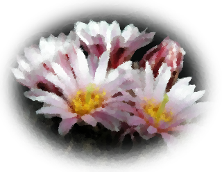 Exercise 6. Use a feathered selection to create an
image like the one shown at the right. The image is a PNG file that becomes transparent
around the edges so that it blends with the background of the image. You can follow
these instructions to do the exercise:
- Open an existing image file in Gimp. I used a cactus flower from Wikimedia Commons. You should use a different image, either one of your own or one from /classes/cs424/gimp-pics. (Note: I applied the "Artistic" / "Oilify" filter to the cactus flower because I liked the effect.)
- This exercise requires an alpha component for the image. A PNG image might already have one; a JPEG definitely will not. To add an alpha component, find the Layers dialog in the upper right of the Gimp window. (There is an illustration of the dialog later on this web page.) Right-click the white area of the dialog, and select "Add Alpha Channel" from the popup menu. (It's close to the bottom.) If the image already had an alpha channel, the command is disabled. You might also consider scaling your image, if it is too big.
- Make a selection around the part of the image that you want to keep. Be sure to leave space between the selection and the boundary of the image to allow for feathering. The example uses an elliptical selection.
- Use the "Select" / "Feather" command to feather the image by a rather large amount, say 40 or 50 pixels.
- You want to cut away the outside of the selection, but the Cut command removes the inside of the current selection. The solution is to invert the selection, which reverses the outside and the inside. Use the "Invert" command in the "Select" menu to do that.
- Apply the "Cut" command, Control-X.
- You might want to crop the image, so you don't have a huge transparent border around the edge. To do that, make a rectangular selection around the part you want to keep, and use the "Crop to Selection" command from the "Image" window.
- Save your image using the "Export As" command in the "File" menu. Be sure to save it in PNG format. That is, use a file name that ends with .png. And remember to use a name such as "ex6.png" or "exercise6.png" so that I will be able to identify it.
Gimp users often put a great deal of work into creating a selection. One way to get more control over selections is with the Path tool, which is discussed below. Another is the "Quick Mask," which gives you complete control of the degree of selectedness of individual pixels. Use the "Toggle Quick Mask" in the "Select" menu to turn the Quick Mask on and off. When the Quick Mask is on, the current selection is represented as a translucent pink overlay on the image. The degree of transparency corresponds to the degree of selectedness of the pixel. The overlay is completely transparent for fully selected pixels. Painting tools will affect the mask rather than the image. For example, drawing with black will add to the mask (and therefore subtract from the selection), and drawing with white, or erasing, will subtract from the mask. When editing the quick mask, consider using the pencil tool instead of the bursh tool. The pencil tool is the same as the brush tool, except that it does not do any transparency or antialiasing.
Paths
A "path" in Gimp is a Bezier curve. Paths are not visible in the actual image, but you can "stroke" a path to make it visible. Paths are not selections, but they are closely related. You can convert a path into a selection, or a selection into a path.
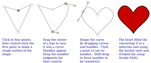
Paths are created using the Path tool (the eighth tool in the Toolbox). To create a path, click a sequence of points with the Path tool. Optionally, you can make a closed path by control-clicking back on the first point. This gives a polygonal path. You can then drag on one of the sides of the polygon to change it from a straight line into a curve. When you do that, the usual Bezier control handles will appear at the endpoints of the curve. You can drag the ends of the control handles for finer control of the shape. At a point where two segments of the curve join, there are two control handles. If you hold down the shift key while dragging, the two handles are constrained to be a straight line and to have the same length, which makes the curve smooth at that point.
Paths are ordinarily not visible except when they are being edited with the Path Tool. However, any path that you create is saved the to Path Dialog. The Path Dialog is one of the four tabbed dialogs in the upper right of the Gimp window. Initially, it is hidden by the Layers Dialog. Click the Paths tab to see the Path Dialog. (See the illustration of the Layers Dialog, later on this page.) The Paths Dialog contains a list of paths. Right-click a path to get a popup menu, which will include commands such as "Path Tool" to go back to editing the path with the Path Tool; "Path to Selection" to convert the path into a selection; and "Stroke Path" to draw line or drag a paint tool along the path.
Exercise 7.Make a heart-shaped path, and do something interesting with it. Save the image to show your work. It would be nice to use more paths to make some additional shapes in the image. This illustration explains how I made a red heart with a black outline—but you should not make the exact same thing:
Layers
Layers are a very important feature in Gimp, and one that can easily lead to confusion if you don't understand what they are and how they work. In Gimp, the final image can be composed from a stack of layers. Each layer is itself an image. The final image is composed by starting with a blank canvas, then copying each layer to the canvas, one after the other, in order from the bottom of the stack of layers to the top. The layers don't have to be the same size as the canvas. They can be translucent, and they can have transparent parts. The advantage of this is that you can edit one layer without changing the others. You can move a layer (with the Move Tool)—and the stuff in the lower layers will be still be there.
It is important to understand that only one layer can be edited at any given time. That layer is called the active layer. This can be annoying if you lose track of which layer is active. It can be especially annoying if the active layer is hidden in the visible image or has been made completely transparent!
Layers are listed in the Layer Dialog, which can be found in the upper right corner of the Gimp window. The active layer is highlighted in the list of layers. Click a different layer in the list to make it active. Right-click the dialog for a popup menu of commands for working with layers. Some of the commands are duplicated in the "Layer" menu. If the right-click is on one of the layers in the list, the popup menu will also include commands that apply to that individual layer. Here is an illustration of the dialog from a project that uses four layers (actually, my solution to the final exercise, with some text added):
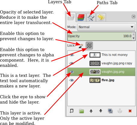
A new image will only have one layer. You can add a new layer with a command in the "Layer" menu or in the popup menu that you get by clicking the Layer Dialog. New layers are also added automatically in some cases. The Text Tool, in particular, always creates a new layer. Text layers are special. They only contain text, and they can only be edited with the text tool. (More exactly, if you edit a text layer with some other tool, it is converted into a regular layer, and you can no longer edit it as text.)
The Paste command will also create a new layer. In this case, the layer is special because it is a "floating" layer. The Move Tool will automatically be selected, and you can use it to drag the floating layer to the desired position. Before you do anything else, you need to either "anchor" the layer (that is, make it part of the active layer), or convert it into a regular layer. To anchor it, just click outside the pasted layer. To convert it into a regular image, right click on its entry in the Layer Dialog, and use the "To New Layer" command in the popup menu. (There will also be an "Anchor" command in the menu.) Again, this behavior can be annoying if you don't know about it.
Funny Money
Exercise 8. For your final Gimp exercise, you should replace Abraham Lincoln in an image of a five-dollar bill with a picture of yourself—or someone else if you prefer. You can even use an animal or flower or whatever, instead. You can find the original five-dollar-bill image in /classes/cs424/gimp-pics. While you are not absolutely required to use layers to do the exercise, since I will have no way of checking that, you will find it easier if you do. For my solution, I used a picture of a well-known faculty member from our faculty page. (In your project, don't use the same person that I used.) Here is my minimal solution:
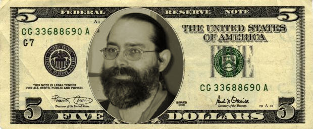
Note that I have adjusted the colors of the inserted image to be similar to the colors used for Abraham Lincoln in the original. The only problem is that the background of the head is not right. The original has is a kind of squiggly matte background. An excellent version of the solution uses the same background. I also applied a little "Artistic" / "Olifiy" fitering to to the head in this version:
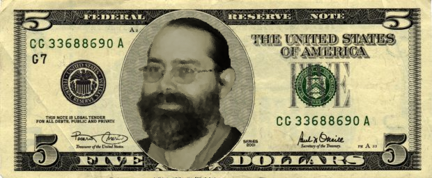
So, how to do it?
First, note that this project might take a while. If you want to put it aside and come back later, you will want all the layer information to be saved. This means that you should save an .xcf file, using the "Save" command. Remember that an .xcf file includes the full Gimp environment. When you Export an image, on the other hand, you are only saving the final image and all the other information will be lost. (But in the end, you should turn in an image file, not the xcf file.)
Start by opening the original five-dollar bill in Gimp. The first task is to create a new layer, over the bill, containing the head that you want to use, including some of its background. You can do that by using Gimp to open the file that contains the head. Then copy-and-paste a selection from that file into the image of the bill. Remember to use the "To New Layer" command to convert the floating layer into a new layer. (Alternatively, you can simply drag the file from the file system onto the bill in the Gimp window. In Linux, at least, this will add the entire image as a new layer, not a floating layer.)
You will probably need to scale the head to fit the available space. You can scale the original image or scale the layer after you have pasted it. (There is a "Scale Layer" command in the "Layer" menu.) It might be easier to get the size right if you temprarily make the layer translucent, so that you can see the bill underneath.
You will also need to adjust the colors. Again, you can do that either before or after you paste the image. The image should be monotone, but with a greenish tint. In my project, I first used the "Desaturate" command in the "Color" menu, which converts the image to grayscale. (I found that it looked better with "Choose shade of gray based on" set to "Luminosity" in the Desaturate dialog.) I then used the "Colorize" command in the "Color" menu to give the image the right tint. Hint: The color is only slightly green, so you will need to decrease the "Saturation" in the Colorize dialog. The colors should be as similar as you can make them to the colors used for Abraham Lincoln in the original!
The next step is to cut an elliptical region out of the head image that just fits the space in the five-dollar bill. Make an elliptical selection with the same shape as that space. This will be easiest if you make the pasted layer invisible so that you can see the bill. (In case you haven't already noticed, you can adjust the shape of an elliptical selection by dragging handles at the corners and along the edges. Use this feature to get the shape exactly right.) Invert the selection, since you want to cut away the part of the image outside of the ellipse. Make sure that the pasted layer is active, and use the Cut command.
At this point, you should have the minimal version of the exercise done. You can export an image to turn in, but you really should try for the "excellent" version by changing the background around the head...
The Clone Tool is used to copy pixels from one image to another or from one point in an image to another point in the same image. (It looks like a rubber stamp in the Toolbox.) You can use it to copy the background that you need from the original five-dollar bill image. To use it, first control-click the point in the image that you want to copy, then click or click-and-drag at the points where you want to copy it. It's usually best to use a brush in which all of the pixels are fully opaque. For this example, I got a good result by using a large brush and clicking a lot of points, rather than clicking-and-dragging.
The problem is to limit the changes to the area surrounding the head. There are several ways to do that, but all of them probably involve making a selection around the boundary of the head. I did that with the Scissors Select Tool, which looks like a scissors in the toolbox. To use it, click at a series of points along the boundary. Gimp will try to fill in a curve along the boundary between the points where you click. After going all the way around the boundary and clicking back on the first point, hit the Enter key to convert the curve into a selection. After I did that, I still had to touch up the selection a bit using the Quick Mask. (In fact, I didn't go a great job on getting the seletion exactly right. I could have spent more time on it. And feathering the selection just a bit might have made the head and the background blend together a little better at their boundary.)
By the way, to work on the background in my project, I made a duplicate of the layer containing the head and worked in that new layer to avoid losing the work I had already done.